| Author | Thread |
Comments Made During the Challenge  |
|
|
07/12/2005 02:05:49 PM |
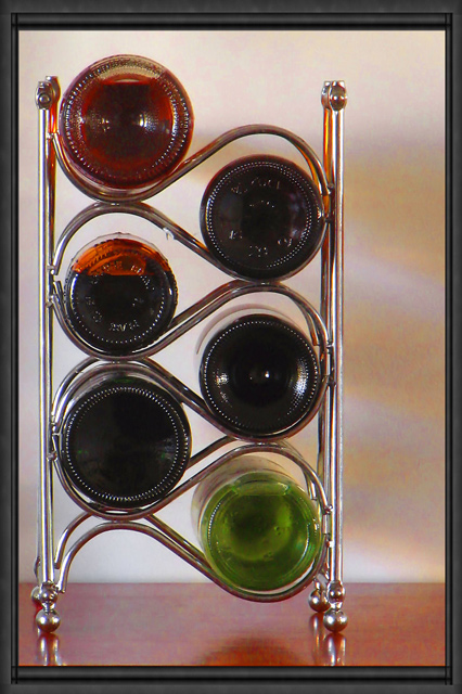
| The shadow bottom centre is slightly distracting. The only thing I can think of that would increase the interest in this shot would be to cast more colour onto the wall behind, possibly by using a very strong point light source. |
|
 Photographer found comment helpful. Photographer found comment helpful. |
|
|
07/11/2005 02:10:11 PM |
| I don't understand the title at all. for some reason this seems to lean a bit to the right. the frame is overly complex. other than that I like this quite a bit. colourful and original. good luck. /7 |
|
| Photographer found comment helpful. |
|
|
07/11/2005 08:22:10 AM |
| I really like this shot but I don't think the frame works (well not for me anyway). Lovely use of different colour bottles |
|
| Photographer found comment helpful. |
|
|
07/10/2005 07:36:08 PM |
|
| Photographer found comment helpful. |
|
|
07/10/2005 12:53:48 PM |
| Is this type of border allowed? It looks overly complex for an open challenge. |
|
| Photographer found comment helpful. |
|
|
07/08/2005 09:05:39 PM |
| Very nice. I like the way you set this up. I think that it works really well to the left of the photo, not dead center. Lighting is good, focus is ok, seems a little soft on the bottles, but I think that's just the bottles themselves, sometimes glass does that. My only real suggestion would be to find 2 other bottles that had solid bottoms. The top 2 that are on the left side are partially empty and you can see that in the photos. Not really a big deal, but makes it seem less uniform. I like the background and you did a very nice job of levelling your 'horizon' line. Visually appealing image. One of my top picks so far. ~Heather~ |
|
| Photographer found comment helpful. |
|
|
07/08/2005 04:14:38 PM |
| nicely staged looks like you took a picture of a poster ... |
|
| Photographer found comment helpful. |
|
|
07/08/2005 09:50:43 AM |
| this is a GREAT idea but i think it could have been implemented better. the background should be seamless, and i would like to see a composition where all the bottles are the same or just one is different to give the shot a focal point. also, the border doesn't really do anything for me. |
|
| Photographer found comment helpful. |
|
|
07/08/2005 09:24:26 AM |
| Someone has been drinking your wine!... Lovely composition would have been over the moon if you hand managed to compose it with out the wooden base but thats me... nice |
|
| Photographer found comment helpful. |
|
|
07/06/2005 10:32:04 AM |
| nicely portrayed. i like the frame here too. |
|
| Photographer found comment helpful. |
|
|
07/06/2005 10:30:31 AM |
| Interesting shot. I wonder how it would look without being so straight-on, maybe more of an angle to reduce the reflections? This could be a photo worth playing with! |
|
| Photographer found comment helpful. |
|
|
07/06/2005 09:47:25 AM |
|
| Photographer found comment helpful. |
|
|
07/06/2005 09:05:07 AM |
| Interesting. Nice composition. The light and focus is done well. 7 |
|
| Photographer found comment helpful. |
|
|
07/06/2005 04:31:29 AM |
| Nice Photo, good shadows on wall, well composed....10 |
|
| Photographer found comment helpful. |
|
|
07/06/2005 03:27:58 AM |
I think this picture really needs to have the subject centered since the wine rack is so symmetrical.
Even though I don't get the title, this is a good idea. |
|
| Photographer found comment helpful. |
|
|
07/06/2005 12:45:51 AM |
|
| Photographer found comment helpful. |
Home -
Challenges -
Community -
League -
Photos -
Cameras -
Lenses -
Learn -
Help -
Terms of Use -
Privacy -
Top ^
DPChallenge, and website content and design, Copyright © 2001-2026 Challenging Technologies, LLC.
All digital photo copyrights belong to the photographers and may not be used without permission.
Current Server Time: 02/01/2026 08:11:28 AM EST.