| Author | Thread |
Comments Made During the Challenge  |
|
|
07/10/2005 10:33:25 AM |
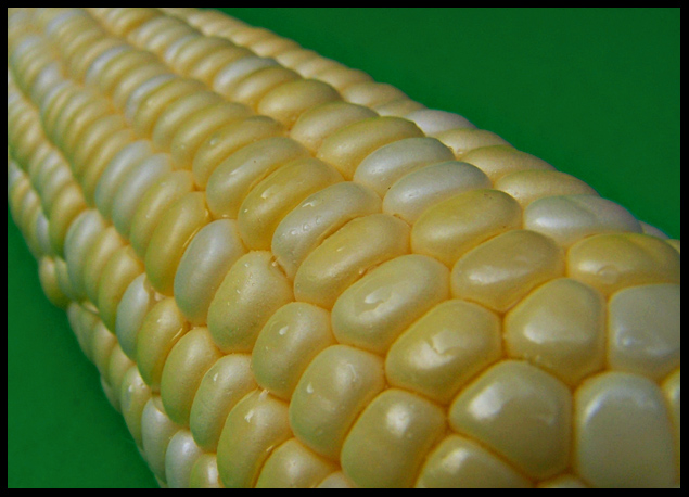
| I like the detail, perspective and composition of this very much. I am not a real fan of selective focus but in macro it is something you have to deal with so it is fine in this. Just a little brighter and a bit more saturation for a suggested improvement but very good as is. |
|
 Photographer found comment helpful. Photographer found comment helpful. |
|
|
07/09/2005 12:30:22 AM |
| Fanciful. Love the title. Incredible sharpness and clarity. |
|
| Photographer found comment helpful. |
|
|
07/07/2005 03:40:38 PM |
| nice idea. color could be brighter. |
|
| Photographer found comment helpful. |
|
|
07/06/2005 10:38:41 AM |
Where's the butter and salt??
|
|
| Photographer found comment helpful. |
|
|
07/05/2005 11:30:15 PM |
| Great subject, but IMO the green distracts the nice yellows. Maybe a different colored background next time. |
|
| Photographer found comment helpful. |
|
|
07/05/2005 04:28:42 PM |
| A tad dark on my screen. The green background works well. |
|
| Photographer found comment helpful. |
|
|
07/05/2005 04:23:59 AM |
maybe a little soft at front where the corn shape changes add interest,
excellent cols |
|
| Photographer found comment helpful. |
|
|
07/05/2005 01:05:57 AM |
| 6 - Nice concept. Given the title, for me it would be better with a front focal point. A slightly different angle too perhaps, not sure. |
|
| Photographer found comment helpful. |
|
|
07/04/2005 12:19:22 PM |
| I've never been that close to corn. LOL This just doesn't send me to the moon. The detail is ok and the lighting fine.... hmmmmm I don't know. Very imaginative idea though. |
|
| Photographer found comment helpful. |
|
|
07/04/2005 11:55:33 AM |
Base: 5
Tech: +2
Subj:+2
Chln:
Total: 9
now.. Butter, salt... yummm |
|
| Photographer found comment helpful. |
|
|
07/04/2005 11:37:19 AM |
| not a love of sweetcorn, but this picture looks fab! love the differences in yellow throughout the pic. |
|
| Photographer found comment helpful. |
|
|
07/04/2005 10:20:56 AM |
|
| Photographer found comment helpful. |
|
|
07/04/2005 03:22:25 AM |
| excellent composition ... very good dof ... good leading lines and use of diagonal. The frame is too thick and distracts ... the lighting in the top right corner is too dark. |
|
| Photographer found comment helpful. |
|
|
07/04/2005 01:12:50 AM |
| I don't think Elton John would recognize it, nor would Dorothy. Fun title though and an interesting angle to the shot. Good luck. |
|
| Photographer found comment helpful. |
|
|
07/04/2005 12:58:33 AM |
| could use more contrast, its a bit drab |
|
| Photographer found comment helpful. |
Home -
Challenges -
Community -
League -
Photos -
Cameras -
Lenses -
Learn -
Help -
Terms of Use -
Privacy -
Top ^
DPChallenge, and website content and design, Copyright © 2001-2026 Challenging Technologies, LLC.
All digital photo copyrights belong to the photographers and may not be used without permission.
Current Server Time: 02/01/2026 12:10:06 PM EST.