| Author | Thread |
Comments Made During the Challenge  |
|
|
05/04/2003 11:21:52 AM |
| I like the design, but the font you chose for the address is disagreeable. |
|
 Photographer found comment helpful. Photographer found comment helpful. |
|
|
05/03/2003 08:30:55 PM |
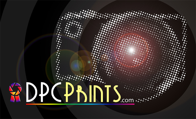
| Like many entries, I think this could use one more line specifically explaining it\'s photographic prints for sale -- don\'t think it would be clear or enticing enough to \"outsiders.\" In fact, using a motif of what looks like halftone dots somewhat implies lithographic prints rather than photos. I like the overall design a lot, just question its suitability for this particular challenge... |
|
| Photographer found comment helpful. |
|
|
05/02/2003 09:19:57 AM |
| I love flares. Nice matrix. |
|
| Photographer found comment helpful. |
|
|
05/01/2003 02:01:14 PM |
Cool idea and nicely done. Because of shorter length of text this balances a little better than the dpchallenge version. I am definitely not keen on choice of font.
6, Kavey |
|
| Photographer found comment helpful. |
|
|
05/01/2003 12:05:45 PM |
| Ok, I REALLY hate the R in this font. But otherwise I love the camera here and in the dpc challenge art. I like the ribbon's strange colors - but it doesn't tell anything about the site. Who would be motivated to come? |
|
| Photographer found comment helpful. |
|
|
05/01/2003 11:17:48 AM |
| I'm not sure about the choice of font. I don't think the R is very clear. I like the rest of the design tho, except that the dotted camera may look a little too busy. |
|
| Photographer found comment helpful. |
|
|
05/01/2003 08:42:03 AM |
| BEAUTIFUL design.... but this does not tell a viewer who is familiar with the site what DPC Prints is. |
|
| Photographer found comment helpful. |
|
|
05/01/2003 01:14:06 AM |
| I like the simplicity and colors and feel of this one. |
|
| Photographer found comment helpful. |
|
|
05/01/2003 12:33:49 AM |
| love the dotted camera and use indication of color. |
|
| Photographer found comment helpful. |
Home -
Challenges -
Community -
League -
Photos -
Cameras -
Lenses -
Learn -
Help -
Terms of Use -
Privacy -
Top ^
DPChallenge, and website content and design, Copyright © 2001-2026 Challenging Technologies, LLC.
All digital photo copyrights belong to the photographers and may not be used without permission.
Current Server Time: 02/01/2026 10:23:30 AM EST.