| Author | Thread |
|
|
08/05/2005 09:38:57 AM |
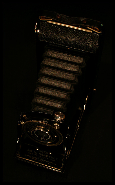
| The composition of this one is great, I just have to agree with the darkness. I think more of a contrast would have worked well for this one, like against a white or maybe even a gold background. I'd try a few different ones. When I enter a challenge, I drive my family crazy because I use about 3 different backgrounds, 4 different views, and click about 40 different photos. :) My husband just shakes his head at me and walks away. LOL |
|
|
|
07/10/2005 05:27:38 PM |
| I think with a little more light your striking composition would have revealed just a bit more of the details that make this a classically styled shot, like the lettering at the front of the camera. (I'm on a new 23" very bright display FWIW.) |
|
|
|
07/07/2005 01:29:27 AM |
| Response to "brutally honest" thread: I liked it. Gave it a 6. Thought it a tad dark, even with my calibrated ViewSonic VX2000. LOVE the highlights and the matching frame, but there's just not enough visible to hold the attention long. |
|
Comments Made During the Challenge  |
|
|
07/05/2005 06:52:43 PM |
| A classic shot. You handled the low-light shooting very well (texture still visible on leather & plastic, & reflections from the metal). The diagonal angle & the carefully chosen color of the frame are great! 9. |
|
|
|
07/05/2005 02:31:02 PM |
|
|
|
07/05/2005 12:41:45 AM |
| Just a little dark. Very close to the best pic in the challenge. |
|
|
|
07/04/2005 11:30:15 PM |
| WAAAAAAAAAAYYYYYYYYY before digital, in fact! |
|
|
|
07/04/2005 07:03:07 PM |
| A little dark, but nice composition and subject :) (Might have fared better on a medium-dark green background perhaps?) |
|
|
|
07/04/2005 10:16:30 AM |
| That is really a great composition. The camera, crop, angle and even the border works perfectly. Just a little work on the lighting and it would be a knock-out IMHO. |
|
|
|
07/03/2005 12:51:37 PM |
| Great idea I think there needed to be a little more light in the picture but, great composition. |
|
|
|
07/01/2005 02:59:25 PM |
| Great idea, with nice composition, but a bit dark. |
|
|
|
07/01/2005 01:47:25 PM |
| A little light and shadow would highlight this. |
|
|
|
07/01/2005 08:42:15 AM |
| Seems underexposed a bit, but might be my monitor. Nice and rich. |
|
|
|
06/30/2005 06:36:13 AM |
|
|
|
06/29/2005 12:31:59 PM |
| I like the composition of the image, but I'd like to see more contrast, and to be able to read the text on the metal plate attached at the bottom of the camera. |
|
|
|
06/29/2005 11:02:50 AM |
| The border adds a very nice touch. |
|
|
|
06/29/2005 09:17:05 AM |
|
|
|
06/29/2005 07:54:57 AM |
| Quite dark. Hides the nice details on the old camera. |
|
Home -
Challenges -
Community -
League -
Photos -
Cameras -
Lenses -
Learn -
Help -
Terms of Use -
Privacy -
Top ^
DPChallenge, and website content and design, Copyright © 2001-2026 Challenging Technologies, LLC.
All digital photo copyrights belong to the photographers and may not be used without permission.
Current Server Time: 02/01/2026 11:51:27 AM EST.