| Author | Thread |
|
|
05/11/2003 07:30:18 PM |
*Critique Club*
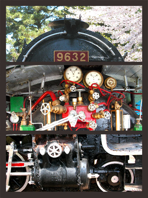
FIRST IMPRESSION: Good idea for the challenge. The separation between shots is not as clear as it could be, though.
CHALLENGE: Meets the challenge.
COMPOSITION: As mentioned a more distinct separation between the shots would be helpful here. Perhaps you could have picked up the maroon and gold from the 9632 sign for frame colors. Also, the 2nd and 3rd shots are a little too tight for my taste, in contrast to the first shot which is obvious, the other two leave me wondering what I am looking at.
TECHNICAL: Exposure seems slighly hot, especially on the middle shot.
CONCLUSION: A good idea, better in my opinion if you'd showed us more in the 2nd and 3rd shots and separated the images better.
Thanks for sharing and good luck in future challenges! |
|
 Photographer found comment helpful. Photographer found comment helpful. |
Comments Made During the Challenge  |
|
|
05/04/2003 02:31:52 PM |
| The bottom two shots come across as cluttered. |
|
| Photographer found comment helpful. |
|
|
05/04/2003 01:26:48 PM |
| interesting images... the background color is not creating great separation.... the flow from top to bottom is a bit awkward as well... |
|
| Photographer found comment helpful. |
|
|
05/02/2003 06:01:29 PM |
| fun photo(s). i think if you had not cropped in so closely on the bottom one that one would have come out a little stronger as the wheels seem almost too tight, but cool idea overall. |
|
| Photographer found comment helpful. |
|
|
05/02/2003 02:05:23 PM |
| Good collection of train parts. I like the top frame best. The middle frame seems a tad over exposed, the red seems so bright as to be unnatural (but I'm going to assume the painter found a VERY bright paint). Lower frame has some parts that seem over exposed, too (same silver colored parts). This is a difficult challenge due to the small frames needed. You got close enough for nice details, maybe too close to get a feel for the machinery. Very hard to call (too close vs not enough detail), I honestly think you did pretty well. 7 Rob the Swash |
|
| Photographer found comment helpful. |
|
|
04/28/2003 08:12:41 PM |
| The overall shot doesn't give a clear sense of 2 or 3 "seperate" shots. |
|
| Photographer found comment helpful. |
|
|
04/28/2003 11:45:52 AM |
| Good idea, nice colours. Good spacing out of the three pictures. Overall a bit too busy. |
|
| Photographer found comment helpful. |
|
|
04/28/2003 09:48:38 AM |
| I think total black instead of dark grey for the border would have been better (or white)... Right now, the three photos kind of blend together, not enough contrast with the border. |
|
| Photographer found comment helpful. |
|
|
04/28/2003 09:12:43 AM |
| Very busy composition. Not sure how this could have been avoided with so many parts. And I'm not entirely sure where thos photos are located on the train. Not that it matters, it's just an observation. |
|
| Photographer found comment helpful. |
Home -
Challenges -
Community -
League -
Photos -
Cameras -
Lenses -
Learn -
Help -
Terms of Use -
Privacy -
Top ^
DPChallenge, and website content and design, Copyright © 2001-2025 Challenging Technologies, LLC.
All digital photo copyrights belong to the photographers and may not be used without permission.
Current Server Time: 04/07/2025 01:03:57 PM EDT.