| Author | Thread |
Comments Made During the Challenge  |
|
|
05/31/2002 08:26:00 PM |
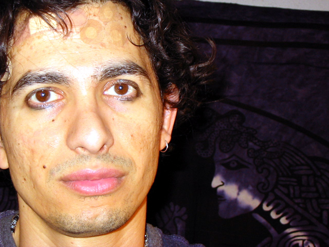
| This certainly illustrates battered and bruised. |
|
|
|
05/30/2002 05:52:00 PM |
| Interesting. I think the lighting is a bit too harsh so that the bandages don't show up as much as they could have if he was lit from the side or something. |
|
|
|
05/30/2002 02:23:00 AM |
|
|
|
05/29/2002 02:50:00 PM |
Is the subject really as yellow as I see him? Lips are rosy pink, eyes brown, hair black, but even the bandaids look yellow. Flash burn between the eyebrows, not good, try taking a step backwards.
Photo 7 Creativity 7 People 8 total 7 |
|
|
|
05/28/2002 11:30:00 PM |
| i like the framing of this picture, but i'm not fond of the flash bouncing off of his skin. not only does it look hot in places, it makes him look sallow--almost jaundiced. Maybe a fill would have worked here? |
|
|
|
05/28/2002 12:31:00 PM |
| Skin tone looks kind of green on my monitor.....Is that the result of the fight?? |
|
|
|
05/28/2002 09:47:00 AM |
| Wow, that's an intense face. I like the background. The lighting could do with some work, but as it is it just makes him look even more sickly. |
|
|
|
05/28/2002 09:33:00 AM |
|
|
|
05/27/2002 08:40:00 PM |
| Ouch! What's going on here? |
|
|
|
05/27/2002 06:57:00 PM |
| I'd hate to see the other guy! Fun shot. Little over exposed. |
|
|
|
05/27/2002 01:54:00 PM |
| this picture is insane. i feel like i'm looking at myself. this man has suffered much pain, but he looks like a fast healer. the pathos, the passion, and the love in this photo are evident. great work. i give it a 10. |
|
|
|
05/27/2002 09:49:00 AM |
| haha almost scary - why the bandaids? |
|
|
|
05/27/2002 09:37:00 AM |
| kind of reminds me of keith richards |
|
|
|
05/27/2002 09:22:00 AM |
| I think a little more creative framing of this photograph would have improved it somewhat... |
|
|
|
05/27/2002 08:29:00 AM |
| Sure he wasn't squeezing zits beforehand? :) Strong flash has caused the reflections off the subject's nose. It's a shame that the band-aids don't really show that well. It took me a while to realise the meaning of your title. I don't really like the placement of the subject either, seeing as there really isn't anything in the background |
|
|
|
05/27/2002 01:12:00 AM |
| Needs more separation of subject from background. Whatever that is to his left, it's distracting. You did capture that "tough/sweet" look . |
|
|
|
05/27/2002 12:08:00 PM |
| I wouldn't want to get in a fight with him. Interesting juxatapositioning with the Medusa head. |
|
|
|
05/27/2002 10:54:00 AM |
| Damn I'd hate to be that guy. Lighting is way to harsh, he's really not to pretty to look at. |
|
Home -
Challenges -
Community -
League -
Photos -
Cameras -
Lenses -
Learn -
Help -
Terms of Use -
Privacy -
Top ^
DPChallenge, and website content and design, Copyright © 2001-2026 Challenging Technologies, LLC.
All digital photo copyrights belong to the photographers and may not be used without permission.
Current Server Time: 02/01/2026 11:20:15 AM EST.