| Author | Thread |
|
|
05/07/2003 08:26:30 AM |
A Comment From The Critique Club
Hi Danny!
Remember me? I'm your personal CCClub commenter ;) I like that role, too, because, as always, your image is very well done :)
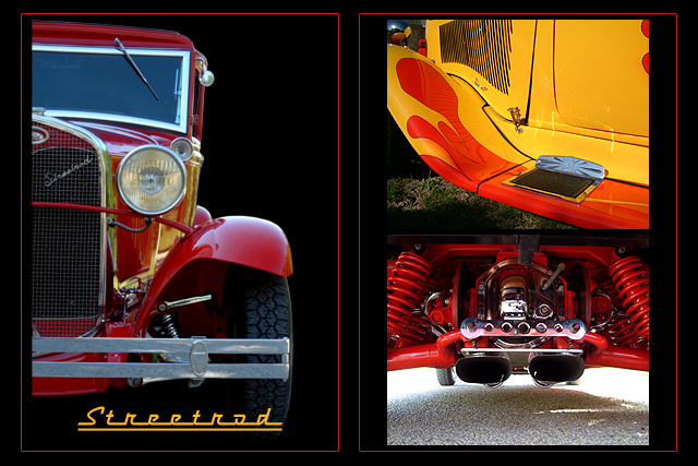
The red and yellow colors of the images are beautiful and nicely contrasted by the black background. I like that the left image instantly gives you a context for the two images on the right and that you have to look at them a little closer to figure out the angle that they were taken at. This way, you combine to get the instant impact that seems to be necessary to score well on DPC as well as the "hold the interest" aspect that is necessary for people to like images beyond the first impression.
The images themselves are very nice, not too many reflections, sharp, good contrast. The image on the left could be a tad lighter and (even though it is not), looks slightly tilted because of the curve of the roof I think.
Overall, I think the multi-image composition feels a little unbalanced to me. The left image is a lot cleaner and less "cluttered" (strong word, I can't think of a better one just now), while the two images on the right both have a lot going on and, on the very first glance, seem to be one image. Maybe separating them through a red border, too, would've helped that, or even just allowing a little more breathing space between the images.
I like the text and the title, the color goes well with the images and the font is just perfect for the old cars, and nicely repeats what is visible in the left image already.
In summary, your entry definitely meet the challenge, the photos tell a great story about beautiful old cars and I think many an old car fan could imagine this on their wall at home. Good work as usual, with only small areas of possible improvements.
Please let me know if you have any questions or comments about this review.
Until my next review of one of your entries, take care ... :)
Franziska. |
|
 Photographer found comment helpful. Photographer found comment helpful. |
Comments Made During the Challenge  |
|
|
05/04/2003 10:21:34 AM |
| Great lighting and wonderful focus! Superb work and excellent idea! |
|
| Photographer found comment helpful. |
|
|
05/02/2003 07:35:24 AM |
love the vibrant colors and the smooth metal :)
beautiful done |
|
| Photographer found comment helpful. |
|
|
05/01/2003 08:01:49 PM |
| Great car! Nicely layed out, good composition. Nice color. Great job! |
|
| Photographer found comment helpful. |
|
|
04/30/2003 04:38:06 PM |
|
| Photographer found comment helpful. |
|
|
04/28/2003 10:09:19 PM |
| I'm not into cars much, but the best part of this triptych is the colors. They are so vivid. The only thing, I think, I would have liked to see differently would be that the border going around the indivdual smaller pictures on the right to seperate them. That's just a small thing though. 9 Good luck in the challenge. |
|
| Photographer found comment helpful. |
|
|
04/28/2003 09:03:00 PM |
| Looks like a poster! Excellent content and layout. |
|
| Photographer found comment helpful. |
|
|
04/28/2003 08:53:14 PM |
| NICE shots of the cars. Love both shots. The frames and text are great also. |
|
| Photographer found comment helpful. |
|
|
04/28/2003 08:51:01 PM |
| Great shot. I like the border color. Very interesting to look at. |
|
| Photographer found comment helpful. |
|
|
04/28/2003 10:29:29 AM |
| Nice composition good details mets the challenge well |
|
| Photographer found comment helpful. |
|
|
04/28/2003 10:11:40 AM |
| oooh...great pic! love the bright colors and the layout of the pics. very well done! 10 |
|
| Photographer found comment helpful. |
|
|
04/28/2003 08:32:55 AM |
Nice individual images, though two are a little overwhelmed by the wonderful yellow one. I find the borders a little confusing. There are three images but the red border seems to combine two of them. That doesn't work for me,
I think the two images on the right are the strongest, individually. |
|
| Photographer found comment helpful. |
|
|
04/28/2003 06:21:11 AM |
| Nice concept, great colours! The choice of font is very good, but the underline is not - the font size might have been larger. I find the alignment distracting, the bigger borders around the pictures at the left vs. at the right. An idea - use just one red border around all three pictures, line them up more precisely, make the lettering boder (and not underlined). |
|
| Photographer found comment helpful. |
|
|
04/28/2003 02:26:00 AM |
| Nice photos and good composition. Nice Job |
|
| Photographer found comment helpful. |
|
|
04/27/2003 08:30:44 PM |
| would make a great poster! |
|
| Photographer found comment helpful. |
|
|
04/27/2003 08:03:43 PM |
| way cool.... especially the front and rear shots... for the fender shot I might have tried a higher angle that showed the steering wheel and some of the interior as well |
|
| Photographer found comment helpful. |
Home -
Challenges -
Community -
League -
Photos -
Cameras -
Lenses -
Learn -
Help -
Terms of Use -
Privacy -
Top ^
DPChallenge, and website content and design, Copyright © 2001-2025 Challenging Technologies, LLC.
All digital photo copyrights belong to the photographers and may not be used without permission.
Current Server Time: 04/08/2025 01:29:59 AM EDT.