| Author | Thread |
Comments Made During the Challenge  |
|
|
06/26/2005 06:30:50 PM |
| a little too small. and the subject is a little subtle not defined enough. |
|
|
|
06/26/2005 04:11:22 AM |
| ok it's metal but it does nothing for me |
|
|
|
06/25/2005 12:54:20 PM |
| Didn't get enough of the subject of metal. |
|
|
|
06/25/2005 09:12:38 AM |
|
|
|
06/25/2005 09:02:15 AM |
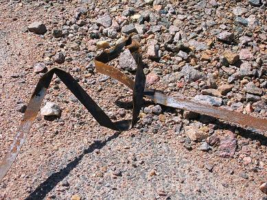
| Odd angles, and this merges with the background in a lot of places. I normally like texture shots, but this one is jarring to me for some reason. Perhaps a closer view would have helped. |
|
|
|
06/24/2005 05:29:46 PM |
|
|
|
06/23/2005 06:50:56 PM |
| Not to be coy, but I'm sure you could do better than this. |
|
|
|
06/23/2005 06:00:29 PM |
| Too small and very busy. No real detail on the subject matter. |
|
|
|
06/23/2005 02:49:32 PM |
| Very plain. There is nothing that jumps out and grabs me. The lighting is too extreme also. |
|
|
|
06/23/2005 10:24:28 AM |
| my goal is to comment on every photo in this challenge..heres urs..good luck..small photo..please read tutorial" preparing photos for entry" to avoid this problem in the future |
|
|
|
06/23/2005 08:59:15 AM |
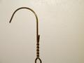
| I think this would be better if it had been a closer shot of the metal. Or if it had a better background. As it is, the rocks are somewhat distracting. |
|
|
|
06/23/2005 08:00:39 AM |
| the color of the metal it's similar to the background, making it difficult to see it. Also the shadows don't help |
|
|
|
06/23/2005 05:40:16 AM |
|
|
|
06/22/2005 05:29:39 PM |
| please increase the dimension of your pix next time. |
|
|
|
06/22/2005 01:56:21 AM |
| dull with a lack of contrast. Could you have moved the metal somewhere with more contrasting colour? |
|
Home -
Challenges -
Community -
League -
Photos -
Cameras -
Lenses -
Learn -
Help -
Terms of Use -
Privacy -
Top ^
DPChallenge, and website content and design, Copyright © 2001-2025 Challenging Technologies, LLC.
All digital photo copyrights belong to the photographers and may not be used without permission.
Current Server Time: 04/08/2025 01:37:05 AM EDT.