| Author | Thread |
Comments Made During the Challenge  |
|
|
06/28/2005 02:56:20 PM |
| The composition is interesting but I really don't care for the coloration effect. I don't think it adds to the image as a whole. B&W may work. |
|
 Photographer found comment helpful. Photographer found comment helpful. |
|
|
06/24/2005 09:13:44 PM |
| this looks too overprocessed for me 4 |
|
| Photographer found comment helpful. |
|
|
06/24/2005 04:53:07 PM |
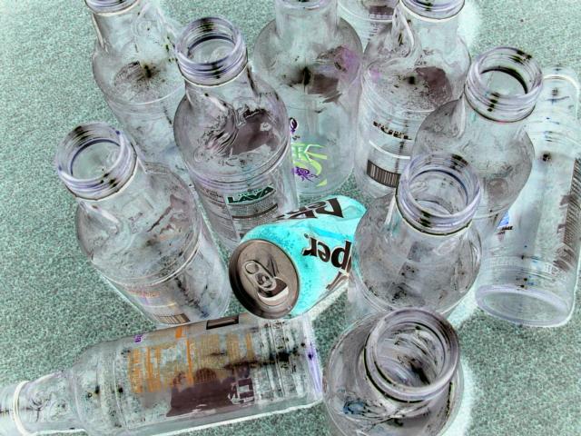
| The main focus is on the glass bottles. |
|
| Photographer found comment helpful. |
|
|
06/23/2005 01:35:09 PM |
Fits challenge= 5
Color/lighting=0
DOF/focus=1
Wow factor/uniqueness=0
Attractiveness= -1
I like Sobe's and the idea but the negative image is distracting (amazing how dirty those bottles look in negative)
Good luck |
|
| Photographer found comment helpful. |
|
|
06/23/2005 09:45:50 AM |
|
| Photographer found comment helpful. |
|
|
06/22/2005 06:34:24 PM |
| my goal is to comment on every photo in this challenge..heres urs..good luck..great hue shift here |
|
|
|
06/22/2005 05:34:49 PM |
| I like the photo concept, but I'm not thrilled by the color treatment. |
|
| Photographer found comment helpful. |
|
|
06/22/2005 04:57:11 PM |
| Interesting experiment... |
|
|
|
06/22/2005 12:22:16 PM |
| i think this may have worked better if it was not inverted - but black and white ... |
|
| Photographer found comment helpful. |
Home -
Challenges -
Community -
League -
Photos -
Cameras -
Lenses -
Learn -
Help -
Terms of Use -
Privacy -
Top ^
DPChallenge, and website content and design, Copyright © 2001-2026 Challenging Technologies, LLC.
All digital photo copyrights belong to the photographers and may not be used without permission.
Current Server Time: 02/01/2026 08:35:51 AM EST.