| Author | Thread |
Comments Made During the Challenge  |
|
|
04/29/2003 09:38:47 PM |
| Really like how this one is kinda overexposed. |
|
|
|
04/29/2003 05:02:11 PM |
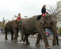
Pretty horsey! It's a bit of a small image and the open area seems as if it is ?glare?
6 Rob the Swash |
|
|
|
04/26/2003 11:11:19 PM |
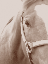
| Hmmmm. I think backing up a bit would have made a more interesting shot. I like your sepia tone, though. It works well on the subject. I would have lost the harness. |
|
|
|
04/25/2003 01:51:04 PM |
|
|
|
04/24/2003 02:41:25 PM |
| Interesting. If it were mine, I'd crop some more off the left side and increase the contrast. Posting larger would help, also. With the screen resolution set to 1600X1200, your image is about 2" tall. |
|
|
|
04/24/2003 06:43:41 AM |
| This pic could do with being made quite a bit bigger. |
|
|
|
04/23/2003 05:35:34 PM |
| Focus seems a bit soft, could use more contrast. Nice composition though. |
|
|
|
04/23/2003 11:58:23 AM |
|
|
|
04/23/2003 11:10:13 AM |
| v small. Difficult to say much else. Has a certain antique quality, until one looks at the eye. |
|
|
|
04/23/2003 10:35:13 AM |
lacks interest.
why so small? |
|
|
|
04/23/2003 10:32:23 AM |
| Simple title, but exact :-) The crop is very good, the contrast might need to be tweaked up a little. Good shot though. |
|
|
|
04/23/2003 10:08:52 AM |
|
|
|
04/23/2003 09:54:53 AM |
| I like the idea of using sepia for this image though it appears not to have enough contrast. The horse's nect at the top of the image is either overexposed or out of focus. This might be a question of depth of field. |
|
|
|
04/23/2003 02:07:22 AM |
|
Home -
Challenges -
Community -
League -
Photos -
Cameras -
Lenses -
Learn -
Help -
Terms of Use -
Privacy -
Top ^
DPChallenge, and website content and design, Copyright © 2001-2026 Challenging Technologies, LLC.
All digital photo copyrights belong to the photographers and may not be used without permission.
Current Server Time: 02/01/2026 09:02:37 AM EST.