| Author | Thread |
Comments Made During the Challenge  |
|
|
06/20/2005 10:23:51 PM |
| L Love the colors. superb graphic qualities. Great comp.Good Luck! |
|
 Photographer found comment helpful. Photographer found comment helpful. |
|
|
06/20/2005 09:17:54 AM |
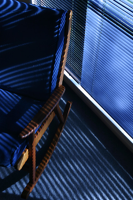
A simply wonderfully beautiful composition. The blues are great. The lines generated by the blinds are terrific. You have an eye for a great capture.
It is unfortunate that some, perhaps even many, voters will have a tough time relating it to the darkness challenge topic and will vote it accordingly.
On the technical side there are only a couple compositional suggestions. I don't know if there is any way you could have changed things so that you could have lighting on the several darkened blinds near the top of the frame but it would have been more uniform and perhaps more balanced if you could.
There is a small dark triangle in the lower left corner of the image. It just feels like there should be more of it or that it be cropped out of the final image entirely. If you cropped it out completely just above where it hits the rocker shadow it would give much better balence to the bottom of the frame. If you included more of it then it might be best to extend it all the way to the rightmost corner. Whichever way looks best would work.
Kudos to you for a terrific image. |
|
| Photographer found comment helpful. |
|
|
06/20/2005 07:32:53 AM |
| Most creative of the bunch. Composition and technical execution are excellent. 9 |
|
| Photographer found comment helpful. |
|
|
06/19/2005 09:21:36 PM |
Here is how I broke down my score.
Content: 1/4
Composition: 2/2
Color/Light: 2/2
Clarity: 1/2
Total:6/10
|
|
| Photographer found comment helpful. |
|
|
06/18/2005 11:23:32 PM |
| Visually striking & should be well supported by the voters. I'm still not sure what darkness means to you; presumably this isn't it? Nevertheless, it's a good looking photograph. |
|
| Photographer found comment helpful. |
|
|
06/17/2005 06:05:18 AM |
| The thing I like most about an image like this in a challenge about darkness is that it stimulates the brain or it does for me anyway. Good on you for thinking outside the square. I like your perspective & crop. Good luck |
|
| Photographer found comment helpful. |
|
|
06/16/2005 04:33:24 PM |
| Fantastic design statement. Great line and lighting. Meets challenge very well. |
|
| Photographer found comment helpful. |
|
|
06/16/2005 02:47:07 PM |
|
| Photographer found comment helpful. |
|
|
06/16/2005 01:36:35 PM |
| The placement of the chair, the lines and the color work well - a very good photo. |
|
| Photographer found comment helpful. |
|
|
06/15/2005 04:36:51 PM |
| I love this picture. I think that the composition is beautiful, the light & shadows wonderful and I think it meets the challenge well (although there seems to be some in the forums who have a fairly strict interpretation of their own, so I'm assuming you may not be doing as well as I think you ought to.) |
|
| Photographer found comment helpful. |
|
|
06/15/2005 03:19:47 PM |
|
| Photographer found comment helpful. |
|
|
06/15/2005 01:15:14 PM |
| nice colors and frame, but where is the darkness |
|
| Photographer found comment helpful. |
|
|
06/15/2005 12:30:05 PM |
| Really nice use of shadow here. I like the blue toning of the shadow. Very nice. |
|
| Photographer found comment helpful. |
|
|
06/15/2005 11:00:20 AM |
| I like the use of lines, and how the shadow is deformed on the top of the chair. 8. |
|
| Photographer found comment helpful. |
Home -
Challenges -
Community -
League -
Photos -
Cameras -
Lenses -
Learn -
Help -
Terms of Use -
Privacy -
Top ^
DPChallenge, and website content and design, Copyright © 2001-2026 Challenging Technologies, LLC.
All digital photo copyrights belong to the photographers and may not be used without permission.
Current Server Time: 02/01/2026 07:28:17 AM EST.