DPChallenge: A Digital Photography Contest You are not logged in. (log in or register
 
Challenge Entries
Portfolio Images
This image is not part of a public portfolio.
Wing Ding
Wing Ding
Olyuzi


Photograph Information Photographer's Comments
Challenge: Birds (Advanced Editing IV)
Camera: Olympus C-2100UZ
Location: Long Island, NY
Date: Jun 12, 2005
Aperture: f 3.5
ISO: 100
Shutter: 1/320
Date Uploaded: Jun 12, 2005

N/A

Statistics
Place: 218 out of 289
Avg (all users): 5.0111
Avg (commenters): 5.7500
Avg (participants): 4.8516
Avg (non-participants): 5.2261
Views since voting: 686
Views during voting: 397
Votes: 270
Comments: 6
Favorites: 0


Please log in or register to add your comments!

AuthorThread
06/22/2005 11:26:37 AM
* Greetings from the Critique Club *

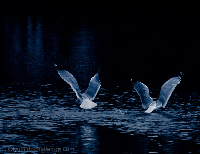
First of all, nice image. I really like the muted tones & blues.

I think you could have cropped it a little more to emphasize the subjects more attractively. As it currently stands, I think there's too much negative space that's not working in your favor for this particular image. Also, the image is a bit too dark - you're losing a lot of the detail that could really enhance this image (especially given different monitor respresentations that don't always portray dark images with the contrast you may see on your own monitor).

I think the composition could be improved with a slightly different crop. As I said, I really like the color choices - muted blue tones really add a nice, peaceful, and somewhat animalistic appeal to the shot. I also think that if the birds were actually closer, it would have more appeal and you could really capitalize on DOF. As it is, you are limited on the amount of focus you can really bring out in this image. Perhaps you were going for something more along these lines, however. If so, I think that the crop again could be utilized more effectively.

I remember this image from the Birds Challenge. If I recall, I believe I scored it a 5. I thought that it certainly met the challenge, but that the overall impression I got from the image was not what it could be. It just didn't hold my attention... (Sorry)

Again too, it's YOUR impression and opinion that matters most when reviewing your work - not someone who is less knowledgeable of the intent of your photograph. You might want to include some notes of your own in the photos you want critiqued, because that gives us a little more to go on when we're providing feedback.

All in all, it's a solid image and as I said, I like the understated blue tones. You've established a nice mood, I just think you could improve the actual execution and presentation of your piece (with some more post-processing work).

Just my 2 cents...

Jimmy
  Photographer found comment helpful.
 Comments Made During the Challenge
06/18/2005 05:10:00 PM
Love the tones in this image. Could have maybe cropped a little out of the top, maybe not. Wish the tails were just a little bit whiter - it owuld provide some balance to all the dark in the image. Focus very good. Good luck in the challenge!
  Photographer found comment helpful.
06/16/2005 09:19:23 AM
Interesting moment.
Like the coloration.
It's an interesting capture with the wings just so, but it doesn't really "say" much, I'm afraid.
  Photographer found comment helpful.
06/14/2005 01:16:13 PM
A little dark, you could stand to crop off the top 40% and about 20% off the left (if you camera resolution is good enough).
  Photographer found comment helpful.
06/13/2005 04:01:22 AM
too dark to me
  Photographer found comment helpful.
06/13/2005 01:43:07 AM
I like the monochromatic look of this image and the positioning of the birds is a bonus 9
  Photographer found comment helpful.


Home - Challenges - Community - League - Photos - Cameras - Lenses - Learn - Help - Terms of Use - Privacy - Top ^
DPChallenge, and website content and design, Copyright © 2001-2025 Challenging Technologies, LLC.
All digital photo copyrights belong to the photographers and may not be used without permission.
Current Server Time: 04/07/2025 01:28:41 PM EDT.