| Author | Thread |
Comments Made During the Challenge  |
|
|
06/21/2005 06:09:33 PM |
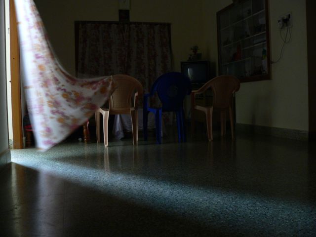
| Do not like the lines of the plastic furniture, but I sure like everything else about this simple, but effective composition. The movement of the drape is so effective as a suggestion that the light is pushing its way into the room. The slivers of light forming an arrow pointing to the light's origin is genius, if intentional. If you had paid more attention to the setup in the darker portions of the frame as you did to the lighted part, this would have been a top 3 for me. As is, it is one of my top ten favorites for this week. |
|
 Photographer found comment helpful. Photographer found comment helpful. |
|
|
06/20/2005 01:06:37 PM |
|
| Photographer found comment helpful. |
|
|
06/20/2005 10:05:05 AM |
The idea is good, especially with the movement of the drapes and the shadow lines in the room.
A photograph is like a well written novel. Pictures should only contain items that support the central theme of the image like text supports the storyline of the novel. If there is storylines that go nowhere or do not tie back with the main story then the novel is not very good.
The same is true of a photograph. In photography elemets that do not support the theme of the image are called distractions and there are several in this image that will cause it to get a lower score.
The electrical wires and whatnot on the wall on the right is a major distraction and so is the television set in the background. The things above the drapery on the far wall do not add to the composition at all. A viewer may wonder what purpose the chairs serve and why is there a blue one in the middle. They will also wonder what the furniture half hidden in the background is for. All this distracts the viewer from your wonderful shadow lines.
This requires some work but you could improve this image dramatically by removing all the distractions from the room and take EXACTLY the same picture. Only this one would be a minimalist interpretation of your theme.
In that picture you would remove all the furniture, the electrical plugin thing on the wall, the TV and chairs and the whatever it is above the far drape. If you cropped out the door on the left so that only the flowing drape can be seen and cropped out the edge of the wall on the right you would have a much improved photograph that viewers will easily understand and score much better. |
|
| Photographer found comment helpful. |
|
|
06/19/2005 03:19:10 PM |
| Very busy, too many distractions. |
|
| Photographer found comment helpful. |
|
|
06/16/2005 02:59:48 PM |
| I'm trying hard to like this photo, but I'm finding the curtain too distracting. This would have been much better if it had been tied back, or hanging still. It does meet the challenge, though. 4 |
|
|
|
06/15/2005 06:20:22 AM |
| IMO, the dark area should be darker. |
|
| Photographer found comment helpful. |
Home -
Challenges -
Community -
League -
Photos -
Cameras -
Lenses -
Learn -
Help -
Terms of Use -
Privacy -
Top ^
DPChallenge, and website content and design, Copyright © 2001-2025 Challenging Technologies, LLC.
All digital photo copyrights belong to the photographers and may not be used without permission.
Current Server Time: 04/08/2025 02:38:44 PM EDT.