| Author | Thread |
Comments Made During the Challenge  |
|
|
06/14/2005 02:37:08 AM |
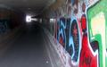
| The focus on this one was lacking. The fact that you tried to balance the lovely light in the upper left with the red in the lower right was a good compostitional choice. If only it were more focused. |
|
 Photographer found comment helpful. Photographer found comment helpful. |
|
|
06/13/2005 02:08:01 AM |
| looks more like an "abandoned building" :-) Not on foucous and the light that comes from above is distracting |
|
| Photographer found comment helpful. |
|
|
06/09/2005 10:27:09 AM |
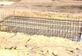
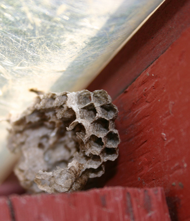
| Obviously an abandoned nest. There isn't any contruction going on here. |
|
| Photographer found comment helpful. |
|
|
06/09/2005 08:15:46 AM |
| Very nice idea and great picture! I like the contrast of nature and man-made.. Also the colors contrast well. A little more focus would have made it perfect, imo. |
|
| Photographer found comment helpful. |
|
|
06/08/2005 06:59:41 PM |
| Nice out of the box. Would have been better if all in focus, IMO |
|
| Photographer found comment helpful. |
|
|
06/08/2005 05:13:52 PM |
| Nice simple lines in this shot...lines in evestrough interesting too..effectively exposes a certain vulnerability. |
|
| Photographer found comment helpful. |
|
|
06/08/2005 01:58:45 PM |
|
| Photographer found comment helpful. |
|
|
06/08/2005 09:45:48 AM |
| Thats last years casting, I need new construction here. |
|
| Photographer found comment helpful. |
Home -
Challenges -
Community -
League -
Photos -
Cameras -
Lenses -
Learn -
Help -
Terms of Use -
Privacy -
Top ^
DPChallenge, and website content and design, Copyright © 2001-2025 Challenging Technologies, LLC.
All digital photo copyrights belong to the photographers and may not be used without permission.
Current Server Time: 04/08/2025 01:47:11 AM EDT.