| Author | Thread |
|
|
03/27/2006 08:06:06 AM |
| fantastic observation, wendy! very, very nice. |
|
Comments Made During the Challenge  |
|
|
06/12/2005 11:56:20 PM |
|
 Photographer found comment helpful. Photographer found comment helpful. |
|
|
06/12/2005 02:56:07 PM |
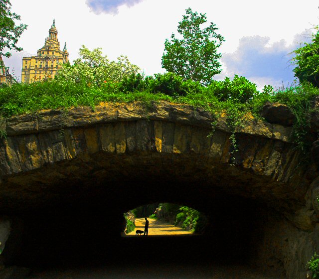
| In this image, the eye (mine, at least) is drawn to the building in the upper left-hand corner. The actual framed subject is small, and just doesn't stick out enough. |
|
| Photographer found comment helpful. |
|
|
06/10/2005 07:55:14 PM |
| Your composition allows the subject to be this nice little surprise...I like that you didn't crop out the top portion (that is probably what I would have done)...well done. |
|
| Photographer found comment helpful. |
|
|
06/10/2005 09:46:31 AM |
| Really cool shot. Very original. I think I would have cropped out some of the dark bottom.. not sure. Nice job! |
|
| Photographer found comment helpful. |
|
|
06/09/2005 01:06:42 PM |
| Love it, but the perspective distortion makes me feel woozy. |
|
| Photographer found comment helpful. |
|
|
06/09/2005 09:57:30 AM |
|
| Photographer found comment helpful. |
|
|
06/08/2005 12:21:56 PM |
| As this is an advanced challenge, I would have preferred to have seen some straightening of the buildings and trees at the top. This would then have made a very pleasing image. |
|
| Photographer found comment helpful. |
|
|
06/08/2005 01:04:06 AM |
| The building at top-left is a distraction. You had a subject in the frame (very few photos have that in this challenge) but you spoiled it by including the whole top 30% of the photo... (5) |
|
| Photographer found comment helpful. |
|
|
06/07/2005 10:00:42 PM |
| Always strange to see somewhere you have been many times in a photo from someone else. Great shot! The contrast between the two areas really captures the feeling of being 'right there.' |
|
| Photographer found comment helpful. |
|
|
06/07/2005 02:32:46 PM |
| This is very nice though I'm not sure you even needed the top half of the picture. 9 |
|
| Photographer found comment helpful. |
|
|
06/06/2005 07:50:45 PM |
| I think that a tighter crop (leaving out much of the sky and all of the building) would make this a stronger picture. As it stands now, I almost don't know where to look - almost as if the man/dog silhouette were an afterthought rather than the main subject. |
|
| Photographer found comment helpful. |
|
|
06/06/2005 05:30:08 PM |
| oh man, i'm completely blown away by this. I find the sky area and the building a bit too light but I realize we all have different tastes when it comes to editing and that sort of thing. Still absolutely have to give this a 10 and add it to my favorites. This had better ribbon. |
|
| Photographer found comment helpful. |
|
|
06/06/2005 12:00:06 PM |
| Good shot and interesting composition. |
|
| Photographer found comment helpful. |
|
|
06/06/2005 11:46:58 AM |
|
| Photographer found comment helpful. |
|
|
06/06/2005 10:07:45 AM |
| like the details on top and the fact that you have some below too, not sure if that comment makes sense or not, but I do love your picture! |
|
| Photographer found comment helpful. |
|
|
06/06/2005 03:09:17 AM |
| Nice photo ... maybe a bit to dark under bridge ... well done |
|
| Photographer found comment helpful. |
|
|
06/06/2005 02:32:29 AM |
| I love the framing but I would turn down the sat on the upper half a scotche |
|
| Photographer found comment helpful. |
|
|
06/06/2005 02:14:24 AM |
| This is nice, but I think a little over saturated on color. You seem to have a lot of color noise, especially in the clouds and the leaves of the trees on top. |
|
| Photographer found comment helpful. |
Home -
Challenges -
Community -
League -
Photos -
Cameras -
Lenses -
Learn -
Help -
Terms of Use -
Privacy -
Top ^
DPChallenge, and website content and design, Copyright © 2001-2026 Challenging Technologies, LLC.
All digital photo copyrights belong to the photographers and may not be used without permission.
Current Server Time: 02/01/2026 07:39:30 AM EST.