| Author | Thread |
|
|
07/12/2003 09:55:27 PM |
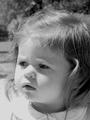
| Nice color contrast...subject is exactly where he should be for the composition of the shot |
|
Comments Made During the Challenge  |
|
|
06/02/2002 09:22:00 PM |
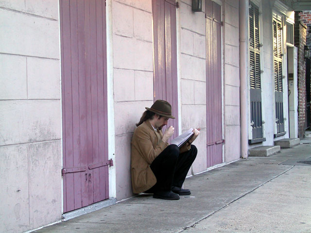
| great picture, beautiful colors. |
|
|
|
06/02/2002 10:54:00 AM |
| Love how this picture captures the architectural environment AND the person. |
|
|
|
06/01/2002 09:57:00 PM |
| Good angle and setting. Great job! |
|
|
|
06/01/2002 09:47:00 PM |
| Nice atmosphere -- it would spark different feelings for me if I knew if it were early morning or late afternoon. I don't know if that element of ambiguity was intentional or not... |
|
|
|
05/31/2002 11:00:00 AM |
| I like the left to right moving feel this picture has -- good use of diagonal lines. If it had been possible to get him more in the left side of the picture, or been closer to him, that may have made a neat shot as well. |
|
|
|
05/30/2002 08:57:00 PM |
| Nicely caught, I like the framing a lot even though it's a wide angle. The colors work great too (brown/purple). I think maybe if you zoomed in or cropped off the blue doors at the end it'd look even better -- just the 3 purple doors. |
|
|
|
05/30/2002 07:47:00 PM |
| its funny... one of the things I read was that the subject should fill the frame, but I kind of enjoy him actually being small. .with no one around himit gives you the impression that he's alone. |
|
|
|
05/30/2002 07:00:00 AM |
| Pretty repetition of those purple doors. Interesting subject, too. If it were my photo, I think I might have been tempted to try cropping way down to eliminate the non-purple doors on the right, which would make the subject a little more off-center, I think. Also, the fact that the door isn't parallel with the edge of the frame bothers me a bit. |
|
|
|
05/29/2002 02:41:00 PM |
| I like the simplicity of this photo. |
|
|
|
05/29/2002 12:03:00 AM |
| Lovely lighting and colours. I feel it would have benefitted by being cropped tighter on the right hand side,. |
|
|
|
05/28/2002 05:23:00 PM |
| This is really nice. I like how his rear end is hovering above the ground to keep his pants clean.... This is a posture I know well. He looks good against the pale wall with the pastel shutters. |
|
|
|
05/28/2002 04:57:00 PM |
| Excellent catch. Colors, pose, and composition make it my top choice. A 10. |
|
|
|
05/28/2002 04:23:00 PM |
| What is the poin? Need to focus on the subject. I close up of the face with the hat may have been more compelling. Get close and personal. |
|
|
|
05/28/2002 11:56:00 AM |
| Well composed shot! I know it's hard to take shots ofpeople, but I would have tried for a more acute angle and a lower apeture to blur the background. |
|
|
|
05/28/2002 01:42:00 PM |
Good photo. Could you have filled the frame with the subject more? (What is in his right hand? espresso?) I like the three purple doors, but could have lived w/o the slatted doors and brick.
Photo 9 Creativity 7 People 8 total 8 |
|
|
|
05/28/2002 01:20:00 PM |
| This just really appeals to me...the color, the subject matter...the doors and windows...I really like this. |
|
|
|
05/28/2002 09:51:00 AM |
| This is gorgeous! Great composition, great camera angle, the lighting is lovely and soft bringing out all the texture of the surroundings, and you captured this guy in a great moment of concentration. |
|
|
|
05/28/2002 08:53:00 AM |
| Great catch. I like how you got a little further down to his level. IMO, this photo would've had a lot more impact though if it had been cropped much tighter, to exclude the shutters in the back and have just teh walls and pinkish doors as the background. That would've also moved the scholar out of the center of the shot and made it follow the ROT. |
|
|
|
05/27/2002 10:36:00 PM |
| The doors behind the figure look good. I like the framing. |
|
|
|
05/27/2002 09:45:00 PM |
| Nice capture! I like this shot.. I would like it even better if the crop was a little tighter around the subjet.. but not TOO much tigher.. just enough to get rid of the doors at the end of the walk way.. :) |
|
|
|
05/27/2002 09:01:00 PM |
|
|
|
05/27/2002 08:32:00 PM |
| It looks as though a lot of time and preparation were put into this picture. Nice Job!!! |
|
|
|
05/27/2002 07:11:00 PM |
| Beautiful, clear, clean in focus with good DOF. Super light, love this-well done. |
|
|
|
05/27/2002 06:34:00 PM |
| The lines and colors are really good. |
|
|
|
05/27/2002 09:03:00 AM |
| Looks very european. I like the emotion in the clenched hand. |
|
|
|
05/27/2002 08:10:00 AM |
| I love this photograph. The leading lines, the muted colors and the concentration of the young man..... |
|
|
|
05/27/2002 10:41:00 AM |
| Took a shot very simular to this when I was in New Orleans recently. Good clarity, I would have liked it cropped so that the subject was not so centered. |
|
|
|
05/27/2002 10:00:00 AM |
| Awesome. Great title. Best title I've seen so far. Really like this composition. |
|
Home -
Challenges -
Community -
League -
Photos -
Cameras -
Lenses -
Learn -
Help -
Terms of Use -
Privacy -
Top ^
DPChallenge, and website content and design, Copyright © 2001-2026 Challenging Technologies, LLC.
All digital photo copyrights belong to the photographers and may not be used without permission.
Current Server Time: 02/01/2026 09:44:03 AM EST.