| Author | Thread |
Comments Made During the Challenge  |
|
|
06/05/2005 06:19:38 AM |
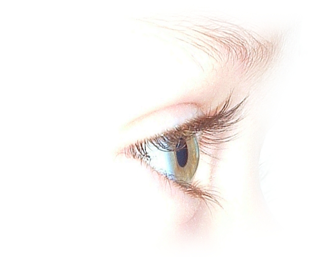
| compelling high key image with just the right amount of detail. one of my ribbon picks |
|
 Photographer found comment helpful. Photographer found comment helpful. |
|
|
06/04/2005 11:03:39 PM |
|
| Photographer found comment helpful. |
|
|
06/04/2005 06:16:22 PM |
| Interesting sylization. It's almost a sketch. Light, ethereal capture. Very nice. |
|
| Photographer found comment helpful. |
|
|
06/03/2005 01:20:50 AM |
| A lovely eye, and a crisp image. I feel like the whites/lights are a little too white/light. Even the darker colors of the eyelashes seem very light, which isn't bad except that we have little contrast to help draw our eye into this photo. |
|
| Photographer found comment helpful. |
|
|
06/02/2005 12:23:15 AM |
| The thumbnail to this image caught my eye immediately and the full size picture is stunning as well, only thing that I do not personally care for is the eyebrow, it kind of stands out on its out and looks a bit wild if that makes sense, still a very beautiful image. Good luck. Going in my favorites! |
|
| Photographer found comment helpful. |
|
|
06/01/2005 12:53:59 PM |
| I really like this. The other eye pictures haven't really done much for me, but this one is very pretty -- it looks like art! |
|
| Photographer found comment helpful. |
|
|
06/01/2005 12:19:58 PM |
| My only 10 of the challenge! Your high key treatment and technical mastery have made a magnificent image out of such a common theme - truly outstanding - must do well |
|
| Photographer found comment helpful. |
|
|
05/31/2005 06:35:44 AM |
| One of the better "eye" pictures in the challenge. <6> |
|
| Photographer found comment helpful. |
|
|
05/31/2005 04:40:16 AM |
| beauty is not in things, but in our eyes |
|
| Photographer found comment helpful. |
|
|
05/30/2005 06:52:54 PM |
| Very nice treatment and a distinctly classy photo. 8. |
|
| Photographer found comment helpful. |
|
|
05/30/2005 04:54:35 PM |
| This is artistic shot, I like the idea very much but think it would be stronger if the eye is more to the left, The left part of the picture when it is like this is something as a waisted space, if on the right it is more an area the is looking at. |
|
| Photographer found comment helpful. |
|
|
05/30/2005 01:56:38 PM |
|
| Photographer found comment helpful. |
|
|
05/30/2005 06:29:59 AM |
| Love the high key approach and the blend to white - nicely done. |
|
| Photographer found comment helpful. |
|
|
05/30/2005 05:25:31 AM |
|
| Photographer found comment helpful. |
|
|
05/30/2005 05:16:38 AM |
| This eye is very beautiful but standing alone nearly without a face is not for my taste. Sorry but I don't like this "burnt out" effects. But I wish you good luck in the challenge. |
|
| Photographer found comment helpful. |
|
|
05/30/2005 05:16:26 AM |
| original idea and a great photo 10 |
|
| Photographer found comment helpful. |
|
|
05/30/2005 12:44:10 AM |
| would have been a 10 if the pupil wasn't blown out - I love this shot. I know I have seen it before, but I still wish I could take one this good! |
|
| Photographer found comment helpful. |
Home -
Challenges -
Community -
League -
Photos -
Cameras -
Lenses -
Learn -
Help -
Terms of Use -
Privacy -
Top ^
DPChallenge, and website content and design, Copyright © 2001-2026 Challenging Technologies, LLC.
All digital photo copyrights belong to the photographers and may not be used without permission.
Current Server Time: 02/01/2026 09:27:58 AM EST.