| Author | Thread |
Comments Made During the Challenge  |
|
|
04/17/2003 09:42:35 AM |
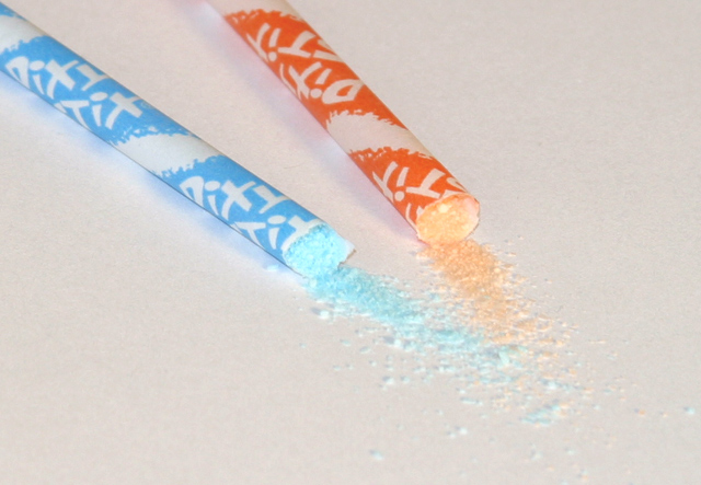
| Well done photo, has a sort of "ad" feel. The white background doesn't contrast well with the light colored candy and half white stix, maybe black would have been better. Good focus, well set up. 7 Rob the Swash |
|
|
|
04/16/2003 05:31:45 PM |
| needs more contrast. too bright and washed out. |
|
|
|
04/16/2003 11:13:27 AM |
| Geeeee I haven't seen them in some time! Pretty pastels and nice diagonal. |
|
|
|
04/15/2003 12:06:38 PM |
| Needed a little more spillage. |
|
|
|
04/15/2003 09:58:19 AM |
| i think a dark background would have brought the colours of the candy out better |
|
|
|
04/15/2003 07:04:05 AM |
| good idea and well composed..three would have made a better composition,in my view. |
|
|
|
04/14/2003 08:28:35 PM |
| nice idea with the candy coming out of the tube. good choice of colors |
|
|
|
04/14/2003 08:10:36 PM |
| a little over exposed. a boost in the post processing saturation would have mayble helped in bringing out the colors a little more. |
|
|
|
04/14/2003 01:55:24 PM |
| these rot your brain and your teeth!! Plus what a mess they make..oh! Good creative idea. Good colors. |
|
Home -
Challenges -
Community -
League -
Photos -
Cameras -
Lenses -
Learn -
Help -
Terms of Use -
Privacy -
Top ^
DPChallenge, and website content and design, Copyright © 2001-2025 Challenging Technologies, LLC.
All digital photo copyrights belong to the photographers and may not be used without permission.
Current Server Time: 04/17/2025 07:11:27 PM EDT.