| Author | Thread |
|
|
05/16/2006 11:51:35 AM |
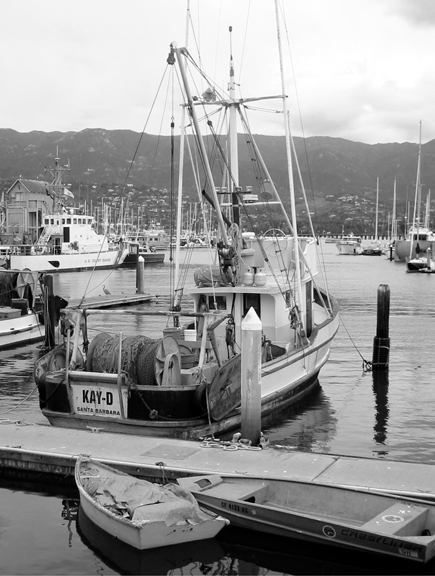
| I tend to like more contrast in my B&W shots, but considering how bright the sky was, you probably made the right decision to not increase the contrast more. The main boat Kay-D just seems to gray to me...could be this work monitor. |
|
 Photographer found comment helpful. Photographer found comment helpful. |
|
|
07/03/2005 12:48:22 PM |
| This is an interesting shot with lots to look at. It would have been nice to have the tops of her masts visible instead of being cut off, but sometimes that can't be helped. I think the focus is good; perhaps a bit more USM could make the name more sharp. The b/w is nice. Did you convert it to disguise a rather dull sky or was the shot a bit overexposed? The contrast could probably be increased a little and the sky burned for a bit more drama. Nice image, though. :o) |
|
| Photographer found comment helpful. |
Home -
Challenges -
Community -
League -
Photos -
Cameras -
Lenses -
Learn -
Help -
Terms of Use -
Privacy -
Top ^
DPChallenge, and website content and design, Copyright © 2001-2025 Challenging Technologies, LLC.
All digital photo copyrights belong to the photographers and may not be used without permission.
Current Server Time: 04/14/2025 09:17:57 PM EDT.