| Author | Thread |
|
|
01/01/2006 03:19:20 PM |
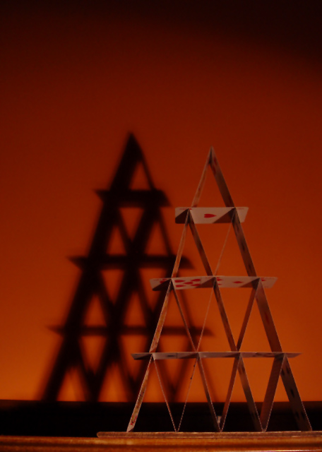
| ROFL @ your photographer's comments! While I like the idea of this shot, I think it lost some of its impact in the execution and presentation. The image is too dark and the angle doesn't allow the viewer to see the cards' faces very well. Also, a different color background might have brightened it up a bit. Again, not trying to be a wet blanket, because it was a great idea and it's not a bad shot, I just think it could have been better (especially after seeing some of your other images and how well you work with lighting and color). |
|
 Photographer found comment helpful. Photographer found comment helpful. |
|
|
09/20/2005 09:36:18 PM |
nice setup and concept. if the cards were a little brighter and stood out more, you may have had a much better score.
|
|
| Photographer found comment helpful. |
Comments Made During the Challenge  |
|
|
05/17/2005 04:20:03 PM |
| Nice shadows, and on close inspection, I see that this collection of triangles is composed of playing cards. Nice setup. The lighting and background however, are dull, which detracts from the photo's appeal for me. |
|
| Photographer found comment helpful. |
|
|
05/16/2005 09:26:36 AM |
| i like this a lot...the shadow and the angle s of the cards...good photo |
|
| Photographer found comment helpful. |
|
|
05/14/2005 08:34:21 AM |
| The shadow makes an interesting part of the composition, but i feel the card need more light on them in the first place |
|
| Photographer found comment helpful. |
|
|
05/13/2005 01:34:02 AM |
| This is one of the more interesting card shots I 've seen so var. |
|
| Photographer found comment helpful. |
|
|
05/13/2005 01:13:45 AM |
| ahhh - the most creative of the house of cards selections on this theme. |
|
| Photographer found comment helpful. |
|
|
05/12/2005 10:01:04 PM |
|
| Photographer found comment helpful. |
|
|
05/12/2005 03:04:01 PM |
| One of the most interesting card houses... the shadow adds alot. |
|
| Photographer found comment helpful. |
|
|
05/12/2005 09:18:55 AM |
| I just love seeing photos that show some efforts put in and I know for sure this needs lots of concentration ;) |
|
| Photographer found comment helpful. |
|
|
05/12/2005 12:27:54 AM |
|
| Photographer found comment helpful. |
|
|
05/11/2005 05:04:14 PM |
| Sweet shot! Love the color of the wall also! |
|
| Photographer found comment helpful. |
|
|
05/11/2005 04:42:13 PM |
| Better if the shadow would be on focus, but I like it. |
|
| Photographer found comment helpful. |
|
|
05/11/2005 01:38:43 PM |
| the image seeems a bit dark, good idea though |
|
| Photographer found comment helpful. |
|
|
05/11/2005 01:13:00 PM |
| I love the color tones, and the contrast of the sharp structure against the shadow. Good job. |
|
| Photographer found comment helpful. |
|
|
05/11/2005 09:49:47 AM |
| wonderful use of the shadow to bring focus to the subject. |
|
| Photographer found comment helpful. |
|
|
05/11/2005 07:25:02 AM |
| i really like this image, if only it were totally in focus. |
|
| Photographer found comment helpful. |
Home -
Challenges -
Community -
League -
Photos -
Cameras -
Lenses -
Learn -
Help -
Terms of Use -
Privacy -
Top ^
DPChallenge, and website content and design, Copyright © 2001-2026 Challenging Technologies, LLC.
All digital photo copyrights belong to the photographers and may not be used without permission.
Current Server Time: 02/01/2026 12:12:26 PM EST.