| Author | Thread |
Comments Made During the Challenge  |
|
|
05/17/2005 09:43:27 AM |
| Love the shot, don't like the sun glare though. |
|
|
|
05/17/2005 09:14:15 AM |
| The exposure seems too dark, but I like the composition. |
|
|
|
05/16/2005 09:55:50 AM |
| Very nice but somewhat too dark on the side |
|
|
|
05/14/2005 01:34:15 PM |
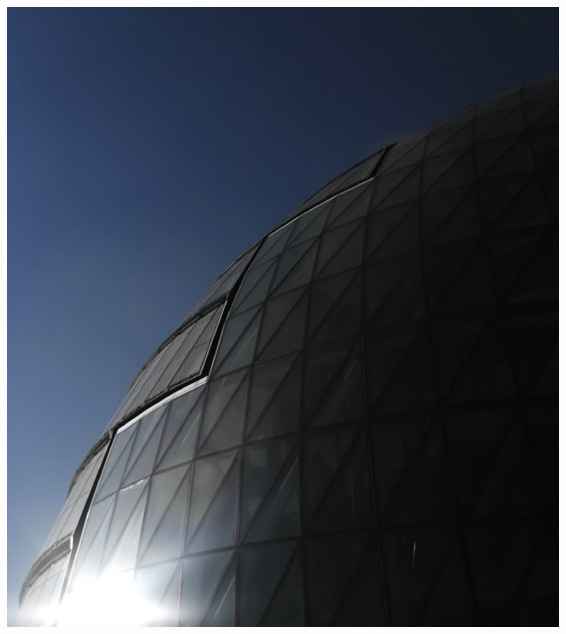
| There are a lot of things I like about this image, particularly the gradients and the diagonal. I don't like the hot spot in the lower left though. 7 |
|
|
|
05/14/2005 05:51:05 AM |
| Love this shot! The reflection and blowout of light is awesome, the shape of the geometric figure is excellent for this challenge and it is also interesting to look at...8 |
|
|
|
05/13/2005 09:27:12 AM |
| This is a good idea. seems a bit too dark. |
|
|
|
05/13/2005 05:22:38 AM |
| Pity about the glare at the bottom, immediately let my eye there insead of around the edge of the dome |
|
|
|
05/13/2005 02:43:36 AM |
very limited power in this case - the power to offend with Nazi jibes and extend the CC zone by about a street.
The glare on the BLHS is just too strong for me on my monitor. I really like the semi-silhouetted nature of the rest of the dome, and the glare adds to that, but it is just slightly too strong. I might have punched up the blues very slightly - there is a very slight dull tint that I get with my P&S: I get rid of it with "colour balance" in PS by moving top slider -10, second slider +3, third slider +7.
|
|
|
|
05/12/2005 10:35:36 PM |
| I don't reallly like the bright spot in the bottom left corner. You could have cropped it out. |
|
|
|
05/12/2005 07:07:32 AM |
| The blown out highlight completely dominates this picture. Remember that bright items tend to move to the front of the image while darks recede. |
|
|
|
05/12/2005 04:40:42 AM |
| I like the scale of everything and the softness of the dome. The glare is a bit to big for me but I still gave it an 8. |
|
|
|
05/11/2005 08:47:57 AM |
| The lighting could probably have been better to bring out the contrast between the geodesic and the sky. Also the bright light in the lower left hand corner is somewhat distracting. |
|
|
|
05/11/2005 02:11:27 AM |
| A photo well taken ... Lives up to the challenge and its name.. keep it up |
|
Home -
Challenges -
Community -
League -
Photos -
Cameras -
Lenses -
Learn -
Help -
Terms of Use -
Privacy -
Top ^
DPChallenge, and website content and design, Copyright © 2001-2025 Challenging Technologies, LLC.
All digital photo copyrights belong to the photographers and may not be used without permission.
Current Server Time: 04/11/2025 10:44:23 PM EDT.