| Author | Thread |
Comments Made During the Challenge  |
|
|
05/17/2005 03:36:06 PM |
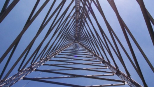
This is an excellent concept. However, the overall low technical quality of the image hurts it more than anything else. Focus is very soft and the colors seem dull. The deep blue spot near the center is a distraction.
There are several things you might try to make this better. One is to take the original picture with the largest f/stop you can. Even if you have to use a tripod it is worth the effort. This will help have better focus. Next, I would work with colors in post for both brighter better colors and more contrast to give the image more visual impact.
Artistically speaking there are two things you might try. One would be to frame or crop the image such that both lower tower legs end exact on each corner. This will level your center triangle better and be better balanced. Another artistic thing you might try is instead of centering tower in the middle of the frame you frame the top of the tower at any of the rule of thirds intersection points. That would give the image a more interesting perspective. |
|
|
|
05/17/2005 02:58:09 PM |
| this is almost a really great photo. only two things are keeping it from being really good to my eye: (1) the lack of focus. it's all too soft. (2) the vanishing point is directly in the center of the frame. moving it to 1/3 on the left or right would help a lot. if these two things were done differently, I'd have scored this quite highly. |
|
|
|
05/17/2005 12:36:42 PM |
| Photo should be larger to do well here (I know, you've probably already received this comment a 100 times). Compositionally, this makes a nice abstract. However, I would prefer more contrast and sharpness. Would be interesting to see this in black and white or color-inverted. |
|
|
|
05/17/2005 10:21:18 AM |
| Love the perspective and shapes in this one. Wish it had a touch more contrast. |
|
|
|
05/17/2005 06:54:01 AM |
but... where's the triangle?
That's a joke. :) |
|
|
|
05/16/2005 11:39:31 PM |
| This would be excellant except that I can find no point of focus. |
|
|
|
05/16/2005 02:53:40 PM |
| Wow, very impressive! It looks like it could do with a bit of sharpening. Also, cropping some of the right and rotating slightly to the left would make the symmetry work better |
|
|
|
05/16/2005 06:55:16 AM |
| I like the way it converges in the center |
|
|
|
05/15/2005 01:25:44 AM |
| Interesting view, but, in my opinion, a little outfocus |
|
|
|
05/11/2005 09:25:13 AM |
| great idea, blurry though. Use USM and or check you aperture when shooting. |
|
|
|
05/11/2005 06:08:52 AM |
This is cool, but it seems a bit blurry and a little small. Also, I would try and make it so that the two bottom lines both come from the corner, or are at least equidistant from the corner.
Good luck with this challenge, you have an intriguing entry. (6) |
|
|
|
05/11/2005 05:50:00 AM |
| This is a nice image. I really like the angle from which you shot htis image. Nice work. |
|
Home -
Challenges -
Community -
League -
Photos -
Cameras -
Lenses -
Learn -
Help -
Terms of Use -
Privacy -
Top ^
DPChallenge, and website content and design, Copyright © 2001-2025 Challenging Technologies, LLC.
All digital photo copyrights belong to the photographers and may not be used without permission.
Current Server Time: 04/08/2025 08:03:54 AM EDT.