| Author | Thread |
Comments Made During the Challenge  |
|
|
04/13/2003 04:44:35 PM |
| I'm not sure about all the shadowing. |
|
|
|
04/12/2003 08:55:39 PM |
| the shadows take away from this photograph for me |
|
|
|
04/12/2003 11:03:22 AM |
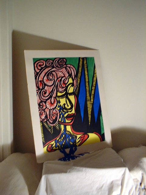
| Love the painting - wish it were closer.... it'd rate MUCH higher, I think! |
|
 Photographer found comment helpful. Photographer found comment helpful. |
|
|
04/11/2003 06:24:04 PM |
| It's a nice drawing, interesting and colorful. Blue is a strong color in this pic, but I think yellow or red are more "the subject colors". This is very close to DPC rules on "Other People's Art", no, it's not the only thing in the photo, but the sheets aren't much of "your addition" to this (monitor under one sheet). Focus seems close, but not razor sharp. 5 Rob the Swash |
|
| Photographer found comment helpful. |
|
|
04/10/2003 08:59:13 PM |
| i love the art! is this something you did? i think you had a good idea for this photo and it is very colorful. another light source to take care of the shadows on the front of the art would be a good idea and might help with the focusing. i do like the shadow at the back of the art, although i would crop out the bottom part of the photo and use more negative space at the top. |
|
| Photographer found comment helpful. |
|
|
04/10/2003 07:46:56 PM |
| that's a wicked shadow being cast along the bottom of the photo, it completely ruins the effect I think you are trying to achieve. As well, the entire shot is out of focus, and composition would be improved if the shot were straighter and shot from more toward the right. Keep trying though! |
|
| Photographer found comment helpful. |
|
|
04/09/2003 11:13:41 PM |
| There is too much space around the picture. The door frame is also distracting. |
|
|
|
04/09/2003 03:28:33 PM |
| Out of focus and poor lighting but I like the idea. The focal pint is in the shadow. I'm afraid some voters might have missed the idea. I needed a 2nd look to cath it. |
|
| Photographer found comment helpful. |
|
|
04/09/2003 11:35:28 AM |
|
|
|
04/09/2003 09:13:59 AM |
| Lots of color in that poster, the shadows are a little annoying though. If you had maybe moved the lighting differently you might have avoided that shadow covering the bottom half of the image. I like the illusion of the tears as if they are flowing onto the sheet itself. |
|
| Photographer found comment helpful. |
|
|
04/08/2003 10:21:20 PM |
| The shadows really are pulling away from this image. Also a tripod would have helped make this image better. |
|
| Photographer found comment helpful. |
|
|
04/08/2003 06:57:39 PM |
| a little blurry.... but I like it...... I'd like to actually see the real thing! |
|
| Photographer found comment helpful. |
|
|
04/08/2003 06:25:05 PM |
| the shadow is very distracting. i also think you should have shot the painting closer up |
|
| Photographer found comment helpful. |
|
|
04/08/2003 12:46:42 PM |
| Seems unnecessarily blurry like camera shake (not a DOF problem). |
|
| Photographer found comment helpful. |
|
|
04/08/2003 10:50:41 AM |
creative ... good work 8
Artwork. Literal photographic representations of the entirety of existing works of art (including your own) are not considered acceptable submissions, however creative depictions or interpretations are permissible. This includes, but is not limited to paintings, sculptures, photographs, drawings, and computer artwork. |
|
| Photographer found comment helpful. |
|
|
04/08/2003 03:26:22 AM |
| A little blurry. Maybe use a trypod. Crop some of the top and bottom as they look like empty space. |
|
| Photographer found comment helpful. |
|
|
04/07/2003 10:27:22 PM |
| the lighting is a llittle low putting shadow on the subject, i would also probably have cropped more |
|
| Photographer found comment helpful. |
|
|
04/07/2003 09:21:45 PM |
| I really like the setting but i think the shadow around the bottom takes away from this shot |
|
| Photographer found comment helpful. |
|
|
04/07/2003 10:15:31 AM |
|
| Photographer found comment helpful. |
Home -
Challenges -
Community -
League -
Photos -
Cameras -
Lenses -
Learn -
Help -
Terms of Use -
Privacy -
Top ^
DPChallenge, and website content and design, Copyright © 2001-2026 Challenging Technologies, LLC.
All digital photo copyrights belong to the photographers and may not be used without permission.
Current Server Time: 02/01/2026 05:25:17 AM EST.