| Author | Thread |
|
|
06/24/2005 12:36:26 PM |
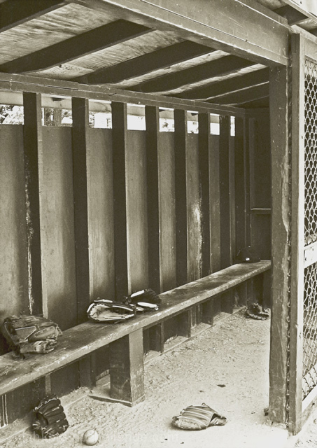
| This does lack contrast, but NOT interest. It seems to be caught between a B&W and a sepia. I suspect the low-side scores are about that or about its "fitness" for the challenge. Given that you have only 13 votes below a 4, and 16 above a 6, it's not so bad. Perhaps another one worth revisiting. (I know, we get so sick of an image during a challenge that it's hard to see it that way, but the long-view is nice sometimes.) |
|
 Photographer found comment helpful. Photographer found comment helpful. |
Comments Made During the Challenge  |
|
|
05/13/2005 08:29:06 PM |
|
| Photographer found comment helpful. |
|
|
05/13/2005 04:09:29 AM |
| Nice composition. Two spots where the glare robs from the photo, lower right and middle of the top of the photo. 9 |
|
| Photographer found comment helpful. |
|
|
05/11/2005 04:29:49 AM |
| It's a very nice composition, but I think it's screaming for more contrast and a darker tone on the ground. |
|
| Photographer found comment helpful. |
|
|
05/10/2005 04:17:08 PM |
| Seems a bit too washed out and over exposed to me but I do like the idea alot... |
|
| Photographer found comment helpful. |
|
|
05/10/2005 07:22:28 AM |
| like the processing here- gives it an "old time" feel |
|
| Photographer found comment helpful. |
|
|
05/09/2005 12:59:07 PM |
| I llike the cepia tone. It gives it an old-timey baseball look. Baseball pictures always touch my heart, being the baseball freaks me and my family are :) |
|
| Photographer found comment helpful. |
|
|
05/09/2005 02:50:02 AM |
|
| Photographer found comment helpful. |
Home -
Challenges -
Community -
League -
Photos -
Cameras -
Lenses -
Learn -
Help -
Terms of Use -
Privacy -
Top ^
DPChallenge, and website content and design, Copyright © 2001-2025 Challenging Technologies, LLC.
All digital photo copyrights belong to the photographers and may not be used without permission.
Current Server Time: 04/07/2025 01:44:45 PM EDT.