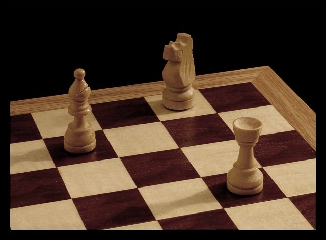
A friend of mine really loves chess, so I just had to do this one. :-)
For those unfamiliar with chess, the bishop (left) is protecting the rook (right), which is protecting the knight (middle) which is protecting the bishop. These "lines of protection" add another level to the "triangle" motif, though viewers who don't understand chess may not get that. Hopefully the title will help.
I tried custom white balance, but it looked stale, so I went with auto-white balance. The resulting yellow tint added a nice richness to the colors I thought, though I had to tone down the saturation quite a bit.
Lighting was a couple incandescent lights, one bouncing off the ceiling and one directed at the board from the right. I also held a white posterboard off-camera on the left to help illuminate the left side. I wanted everything in focus so I used an aperture of f/22. This, together with ISO 100 and low lighting, meant I needed a 13 second exposure.
Processing included level and saturation adjustments, rotating, cropping, resizing, sharpening, and adding a border.
[2034]
Statistics
Place: 214 out of 413 Avg (all users): 5.0224 Avg (commenters): 5.4286 Avg (participants): 4.7429 Avg (non-participants): 5.3281 Views since voting: 940 Views during voting: 340 Votes: 268 Comments: 7 Favorites: 0
Very cool image. IMO always, I would like to see richer wood tones. I see 3 triangles, two on the board are insignificant. The main tri.. formed by the chess pieces are subjective and does not stand out as a key subject. But I like the presentation.
I would lighten this (curves or levels) a little bit more to make the colors of the wood more vivid as the grain of the wood is beautiful as well as your side lighting.
I like chess shots in general, and appreciate here the thinking that goes into the placement and type of the chess pieces, one protecting the next, and clearly describing not only a triangular configuration in terms of physical relationships, but also in terms of the roles, tasks and possible scope of the individuals. The lighting could be more powerful here, and the shadows cast by the pieces are slight distraction points for me. Perhaps this would also be very effective as black and white? 7
I like the idea of this photo but the implementation is in my opinion too put on and obvious. The composition is not from a real play. A small hint: the "triangle" could be shown allusively. One or two black soldiers to the picture and in spite of that the white players would dominate the picture.