| Author | Thread |
Comments Made During the Challenge  |
|
|
04/13/2003 08:01:34 PM |
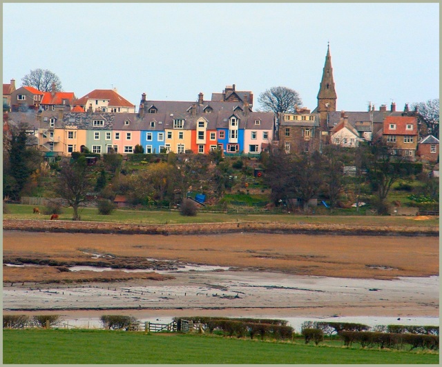
| If you just kept the houses part and cropped the grass on the bottom would be 10, like this only 9! |
|
 Photographer found comment helpful. Photographer found comment helpful. |
|
|
04/13/2003 05:21:44 PM |
| I think you should have been closer for this picture, could have been a 9 or 10. |
|
| Photographer found comment helpful. |
|
|
04/12/2003 08:13:05 PM |
| I really like this, I think I would have adjusted this a bit to make it level though. |
|
| Photographer found comment helpful. |
|
|
04/12/2003 04:09:31 PM |
| the horizon is tilted, and I think a lot of the foreground could have been cropped out. but the colors on the homes are nice. |
|
| Photographer found comment helpful. |
|
|
04/11/2003 12:48:06 PM |
| Nice photo, but it seems to be dipping a bit from left to right. Great colors though. |
|
| Photographer found comment helpful. |
|
|
04/11/2003 12:41:19 PM |
| There are a lot of distracting elements in this photo - the reflection in the near water, the crappy land in the middle, the trees before the color...Is color really a central and tying idea to this pic or is it just a pic with good colors in it? Just my 2c. :) Keep shooting! |
|
| Photographer found comment helpful. |
|
|
04/11/2003 12:22:17 PM |
| Good protrayal of color. I would love to see some close ups of these houses too. |
|
| Photographer found comment helpful. |
|
|
04/11/2003 12:43:22 AM |
| Very nice city-scape.. I would like a few details on where this is.... |
|
| Photographer found comment helpful. |
|
|
04/10/2003 08:37:57 AM |
| Excellent capture! Good choice to add so much foreground into the image. As I see it this pic had 4 different levels: The grass, the river, the houses and the sky background, well done. |
|
| Photographer found comment helpful. |
|
|
04/09/2003 03:36:46 PM |
| The colors on the buildings and the green in the grass and trees are captured very nicely. That bit across the bottom of the photo looks really strange. Even though I believe you are looking down a hill, I initially thought the trees and fences were being reflected in water, but on closer inspection, I decided not. It looks out of place and really odd to me. |
|
| Photographer found comment helpful. |
|
|
04/09/2003 01:54:40 PM |
| Something seems lopsided here. I think it would be better if the line of the housetops was level to the top of the frame. Also the focus does not seem sharp enough. If you look at the clock on the church, for instance, that is out of focus. Sharpness improves an image a lot if you can manage it. |
|
| Photographer found comment helpful. |
|
|
04/09/2003 11:02:48 AM |
| Might be better with the river cropped out. |
|
| Photographer found comment helpful. |
|
|
04/08/2003 08:46:52 PM |
| horizon is a bit titled..is that a river without water in it in the middle foreground? |
|
| Photographer found comment helpful. |
|
|
04/08/2003 07:57:50 PM |
| Seem to be sliding down to the right but maybe my screen. Well done |
|
| Photographer found comment helpful. |
|
|
04/08/2003 04:37:31 PM |
| Couple of things on this photo: I like it very much but wish it had been level. It seems slanted to the right giving the apearance that the houses are sliding to the right. I would also have liked to see the foreground cropped out up to the wall making for a wide photo matching the row of houses. I found the brown and green pulled me away from the main interest of the colorful homes. Very unique colorful shot. |
|
| Photographer found comment helpful. |
|
|
04/08/2003 03:56:22 PM |
| This marvelous colorful village is nicely set in its environment, but I still would crop further (or get closer) to heighten the color. |
|
| Photographer found comment helpful. |
|
|
04/08/2003 03:40:17 PM |
| Very nice image. I really like the variety of colors and texture you used. Good job. |
|
| Photographer found comment helpful. |
|
|
04/08/2003 02:15:29 PM |
| nice job nice use of color |
|
| Photographer found comment helpful. |
|
|
04/08/2003 11:38:20 AM |
| the houses look great, even if a little tilted to the right, but the foreground doesn't add much interest to this picture... rotation of one degree to the left and crop on the bottom would impove it a lot... |
|
| Photographer found comment helpful. |
|
|
04/08/2003 11:28:50 AM |
| I like this picture, but I get the funny feeling that it is a bit tilted to the right? Maybe that's just an impression. Nice. |
|
| Photographer found comment helpful. |
|
|
04/08/2003 09:53:12 AM |
| Too much foreground detracts from the visual impact of the colors. |
|
| Photographer found comment helpful. |
|
|
04/08/2003 02:56:53 AM |
| I like the color of the buildings and the sky. The green forground is nice but the muddy brown takes away, so I would have cropped this one nearly in half. |
|
| Photographer found comment helpful. |
|
|
04/08/2003 02:36:24 AM |
| Very colourful houses. To give this photograph more oomph, I would competely crop out the bottom half of this picutre, as it adds nothing to the photograph, and brighten and increase the contrast (either in camera or with use of an imaging program like Photoshop) so that the colours of the houses stand out more vividly. |
|
| Photographer found comment helpful. |
|
|
04/07/2003 11:22:22 PM |
| looks neat but needed closer in on the buildings |
|
| Photographer found comment helpful. |
|
|
04/07/2003 10:22:57 PM |
| The bottom could have been cropped to bring out the colours of the buildings |
|
| Photographer found comment helpful. |
|
|
04/07/2003 06:02:20 PM |
| Should have zoomed way in on the left 2/3rds of the buildings leaving less of the foreground. You'd need a pretty powerfull lens however to do this. The pic is also tilted to the right. |
|
| Photographer found comment helpful. |
|
|
04/07/2003 04:09:24 PM |
| This does not look real to me, but I am sure it is. Nice colors |
|
|
|
04/07/2003 12:56:03 PM |
|
| Photographer found comment helpful. |
|
|
04/07/2003 11:10:59 AM |
| Perhaps positioning the houses low in the frame, exposing the sky, would have made this a better photo. Or even cropping to include only the houses. |
|
| Photographer found comment helpful. |
|
|
04/07/2003 10:51:01 AM |
| Wow look at all the colors. Wonderful find. I think the crop is wrong.the mud, pasture at the bottom could go they only distract. Good work. |
|
| Photographer found comment helpful. |
|
|
04/07/2003 03:43:45 AM |
| horizon is a little 'off' great use of colour though! |
|
| Photographer found comment helpful. |
|
|
04/07/2003 02:47:15 AM |
| Nice natural shot although it seems to be a bit tilted to the right. |
|
| Photographer found comment helpful. |
Home -
Challenges -
Community -
League -
Photos -
Cameras -
Lenses -
Learn -
Help -
Terms of Use -
Privacy -
Top ^
DPChallenge, and website content and design, Copyright © 2001-2026 Challenging Technologies, LLC.
All digital photo copyrights belong to the photographers and may not be used without permission.
Current Server Time: 02/01/2026 07:20:27 AM EST.