| Author | Thread |
Comments Made During the Challenge  |
|
|
05/17/2005 06:16:51 PM |
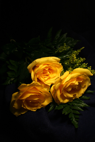
| Some may vote down for the size, but I won't. ;-) The flowers are pointed a bit downward, which (to me) gives a sort of "submissive", or "shy" type of feeling, especially with the large dark framing and shadows in the petals of the lower two flowers. Sweet. :-) |
|
|
|
05/17/2005 05:33:23 PM |
| It's a good photo, but a tri-angle needs lines, or the illusion of lines. That idn't the case here. I gave it a 5 |
|
|
|
05/17/2005 05:38:32 AM |
|
|
|
05/17/2005 05:33:28 AM |
| I would have liked to have seen lighting on all 3 roses evenly as the light looks to be off center and mainly showing the right rose.7 |
|
|
|
05/12/2005 05:42:30 PM |
| The angle does not flatter the beauty of these flowers... the seem too flat. Great idea, I would have taken it a bit more straight on. |
|
|
|
05/12/2005 07:02:25 AM |
| Creative and very nice! Maybe a little more lighting on the lower left rose. |
|
|
|
05/11/2005 06:52:18 PM |
| this looks like it was painted by an old Dutch Master. Add a fancy gold frame and it would fit in a museum or over someones mantel. |
|
|
|
05/11/2005 12:49:36 PM |
| For me? Why, thank you. Lovely color and spotlighting. They're very shy though. Would be great if their 'faces' were showing up and a tighter crop. |
|
|
|
05/11/2005 12:17:11 AM |
| Nice picture, but really engaging me. |
|
|
|
05/10/2005 09:12:28 PM |
| the yellow against the black is nice. But it seems like there is too much black up top. That space would be good for some writing or title. |
|
Home -
Challenges -
Community -
League -
Photos -
Cameras -
Lenses -
Learn -
Help -
Terms of Use -
Privacy -
Top ^
DPChallenge, and website content and design, Copyright © 2001-2025 Challenging Technologies, LLC.
All digital photo copyrights belong to the photographers and may not be used without permission.
Current Server Time: 04/08/2025 01:37:42 AM EDT.