| Author | Thread |
|
|
04/20/2003 08:58:32 AM |
Critique Club Comments by Grayce
Greetings!
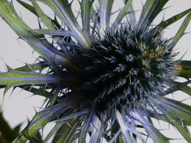
This image is very strong on texture. I like it!
Your composition is good, and it fills up the frame nicely. You have a good, strong diagonal, which is appealing.
Lighting and exposure are good. The shadowed part could probably have a bit more light, but there is enough to see that great texture.
Some have said the focus is a bit soft, yet your depth of field appears to be good. I suspect there was a bit of camera shake, or the thistle moved. For a close up like this, it's best to use a tripod. I've taken many closeups without one, and have had the same problem. Slight blur.
The coloring, which is the theme for this challenge, doesn't stand out too much. Although I love your subject, the thistle, it isn't the best subject for a "color challenge."
Overall, I like this, and I look forward to seeing more of your work. Welcome to DPC!!!
If you have any questions regarding my critique, please contact me through my profile.
Regards,
Grayce |
|
 Photographer found comment helpful. Photographer found comment helpful. |
Comments Made During the Challenge  |
|
|
04/12/2003 01:15:20 PM |
| I have got an impression that the flower itself is a bit out of focus, the main focus is on the leaves, great idea otherwise, Good luck |
|
| Photographer found comment helpful. |
|
|
04/12/2003 12:22:26 PM |
| Probably the wrong shot for color. |
|
| Photographer found comment helpful. |
|
|
04/11/2003 03:03:22 PM |
| "sharp" focus would have been better on a clearly defined subject. (sorry for the pun, should be +1 on score just for having to read that!) |
|
| Photographer found comment helpful. |
|
|
04/11/2003 12:12:47 AM |
| The word OUCH comes to mind..... |
|
| Photographer found comment helpful. |
|
|
04/10/2003 08:34:36 AM |
| Clarity is the issue here more than anything. The lighting doesn't look so great judging by the really harsh shadow left in the bottom left corner. Not really a lot of color either. |
|
|
|
04/09/2003 02:29:21 PM |
|
| Photographer found comment helpful. |
|
|
04/09/2003 08:55:17 AM |
| Good compostition and crop here. Personally I would have increased the saturation a little to bring out the green and purple/blue more. |
|
| Photographer found comment helpful. |
|
|
04/09/2003 02:29:26 AM |
| Seems a little out of focus. Looks like it's not a good day to take pictures, overcast BG. Too much sadow takes away from the shot. |
|
| Photographer found comment helpful. |
|
|
04/08/2003 02:16:56 PM |
|
| Photographer found comment helpful. |
|
|
04/08/2003 10:39:36 AM |
and do scottish girls get a dozen of these for valentine's day?
not necessarily the best flower to pick for a color competition, nor the strongest shot you could take of it - the colors seem a bit dull and the main part (whatever it's called) of the 'flower' is a little dark. |
|
| Photographer found comment helpful. |
|
|
04/07/2003 06:39:28 PM |
|
|
|
04/07/2003 12:53:03 PM |
|
|
|
04/07/2003 12:11:07 PM |
| Lighting could have been alittle better and shown off the blue but a nice composition and great texture. |
|
| Photographer found comment helpful. |
Home -
Challenges -
Community -
League -
Photos -
Cameras -
Lenses -
Learn -
Help -
Terms of Use -
Privacy -
Top ^
DPChallenge, and website content and design, Copyright © 2001-2026 Challenging Technologies, LLC.
All digital photo copyrights belong to the photographers and may not be used without permission.
Current Server Time: 02/01/2026 07:23:10 AM EST.