| Author | Thread |
|
|
05/10/2005 01:20:13 AM |
**Critique Club**
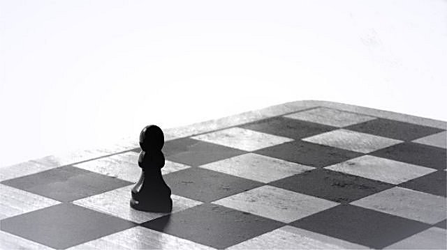
Hello Heidi -
I haven't done one of these for awhile, so here goes.
Reading through the comments you received, I think everyone offered you a lot of good advice. Here are a couple comments to go along with what has already been said
The idea is good, b&w is a good choice, but you have to be careful of overexposing your highlights. I recommend reading about The Zone System that Ansel Adams developed. The jest is, in a b&w photo, you will have a range from pure white to pure black with minimal loss of details in the highlights and shadows. Do a Google search on the Zone System and you will find lots of information.
Like someone mentioned below, a different perspective would have helped. The background is definately a disctraction. Maybe if you put the pawn at one end of the board and then shot down onto the piece at a slight angle, filling the frame with the board it would have helped.
Just some ideas/suggestions. I hope you find them helpful.
Regards,
Chris |
|
 Photographer found comment helpful. Photographer found comment helpful. |
|
|
05/05/2005 07:04:19 AM |
| Thank you all for the comments. |
|
Comments Made During the Challenge  |
|
|
05/03/2005 01:17:28 PM |
| the white background fading into the board is a little distracting |
|
| Photographer found comment helpful. |
|
|
05/02/2005 11:47:33 PM |
|
| Photographer found comment helpful. |
|
|
05/02/2005 10:31:42 PM |
| I like the different shades of grey. 6 |
|
| Photographer found comment helpful. |
|
|
05/02/2005 06:42:11 PM |
| I like the idea, alone on the chessboard ;) good composition |
|
| Photographer found comment helpful. |
|
|
05/02/2005 03:18:46 AM |
| well done - meets the challenge well, good title, good subject matter, nice title. just could have been a tad sharper. |
|
| Photographer found comment helpful. |
|
|
05/01/2005 05:57:35 PM |
|
| Photographer found comment helpful. |
|
|
04/30/2005 03:59:07 AM |
| A little overexposed, but the idea is great |
|
| Photographer found comment helpful. |
|
|
04/30/2005 02:09:22 AM |
| The chess piece does not show detail for me and I think the lighting needs to be changed in the shot. Good idea. |
|
| Photographer found comment helpful. |
|
|
04/29/2005 11:50:26 PM |
i like the solitare chess piece but im not seeing nice smooth shadows on the piece.
Also the board looks like a little too much contrast. |
|
| Photographer found comment helpful. |
|
|
04/29/2005 11:42:35 AM |
|
| Photographer found comment helpful. |
|
|
04/29/2005 10:35:58 AM |
great shot, would have been a perfect one for the moods challenge.
|
|
| Photographer found comment helpful. |
|
|
04/29/2005 08:41:26 AM |
| I think you captured minimalism perfectly..the board really adds to the background so that you dont have too much wasted space. Very nice. |
|
| Photographer found comment helpful. |
|
|
04/29/2005 04:27:53 AM |
| This is a great concept. I really like the idea. Focus seems like it could be a tad sharper. I'm not sure if I'm crazy about all the white space, seems a little harsh. I'm wondering if maybe it would make for a stronger shot with a perspective showing more of the board? |
|
| Photographer found comment helpful. |
|
|
04/29/2005 02:27:15 AM |
| nice idea, but the white background leaves a blown feeling. I'd rather took a shot from such a POV where the field occupies the whole space of the photo |
|
| Photographer found comment helpful. |
|
|
04/28/2005 07:16:48 PM |
| I like the subject but smaller would have been better. |
|
| Photographer found comment helpful. |
|
|
04/28/2005 02:45:01 PM |
| the exposure seems off, but I like the take. |
|
| Photographer found comment helpful. |
|
|
04/28/2005 01:33:45 PM |
|
| Photographer found comment helpful. |
|
|
04/28/2005 11:26:07 AM |
| I really like this image. I thought about using a checker board but thought it would be too busy but the way you captured it looks great! good job. |
|
| Photographer found comment helpful. |
|
|
04/28/2005 01:37:26 AM |
| Focus is a little bit of a problem here, next time use a spot on the black and then play with the levels to get the bright background |
|
| Photographer found comment helpful. |
|
|
04/27/2005 11:17:29 PM |
| I love this style - nice! would have used a clean white background though..it's got some discoloration |
|
| Photographer found comment helpful. |
|
|
04/27/2005 08:15:02 PM |
| This is a good idea, but the white background is a little too much for me. I think you could have still met the challenge and improved the shot by using the board as the entire background. |
|
| Photographer found comment helpful. |
|
|
04/27/2005 07:50:52 AM |
| strong BW, maybe more sharpness |
|
| Photographer found comment helpful. |
|
|
04/27/2005 06:31:29 AM |
| Excellent, nice and minimal, so fits the challenge well. Good tones too |
|
| Photographer found comment helpful. |
|
|
04/27/2005 03:19:55 AM |
| Cool shot, background is a bit harsh |
|
| Photographer found comment helpful. |
Home -
Challenges -
Community -
League -
Photos -
Cameras -
Lenses -
Learn -
Help -
Terms of Use -
Privacy -
Top ^
DPChallenge, and website content and design, Copyright © 2001-2026 Challenging Technologies, LLC.
All digital photo copyrights belong to the photographers and may not be used without permission.
Current Server Time: 02/01/2026 12:12:53 PM EST.