| Author | Thread |
Comments Made During the Challenge  |
|
|
05/03/2005 03:52:44 PM |
|
|
|
05/02/2005 03:40:17 PM |
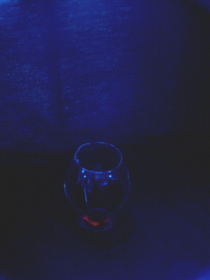
| I can barely make out the glass... |
|
|
|
05/02/2005 03:02:40 PM |
|
|
|
05/02/2005 09:09:35 AM |
|
|
|
05/02/2005 08:28:53 AM |
| I'm sorry but it's too dark, I can't see any detail... maybe try some additional lighting |
|
|
|
05/01/2005 06:12:07 PM |
| i feel your image is a bit too small to judge well... also your darks arent black but rather dark grey. |
|
|
|
05/01/2005 09:41:12 AM |
|
|
|
04/30/2005 03:21:06 PM |
|
|
|
04/30/2005 11:04:17 AM |
| IMO, this picture needs more light. It's very har to make out any detail. |
|
|
|
04/30/2005 05:37:35 AM |
| Maybe it is my monitor, but I can not make out what this is supposed to be. Is it a glass? 4 |
|
|
|
04/29/2005 10:43:10 PM |
| this is a very dark image |
|
|
|
04/29/2005 05:38:25 PM |
| Pretty, but hard to see the subject |
|
|
|
04/29/2005 04:51:25 PM |
| It's hard to tell what I'm looking at because it's too dark and the size of the image is a little small. |
|
|
|
04/29/2005 01:33:38 PM |
Meets challenge description. 10
Meets definition of minimalism...10
Technical.....6 Lacks clarity
Artist........this is a very moody piece and I am sure the color is the reason for this, I'm not sure what the object is but I do not know if that matters because all of the elements seem to be working in harmony with each other. I like this image and feel that from edge to edge it is working as one.....10......because it feel like a real minimalist image.
Average score .... 9 |
|
|
|
04/29/2005 11:52:03 AM |
| a better focal point before taking the shot might have worked better |
|
|
|
04/29/2005 11:20:18 AM |
| interesting use of theme, too dark |
|
|
|
04/29/2005 12:51:04 AM |
|
|
|
04/28/2005 07:50:26 PM |
| nice....in an erie kind of way |
|
|
|
04/28/2005 06:30:30 PM |
| This photo is way to dark to really appreciate. |
|
|
|
04/28/2005 03:37:38 PM |
|
|
|
04/27/2005 10:48:44 PM |
| this image is very dark, which obscures the detail fo the subject. It also seems slightly out of focus, or perhaps grainy. I do like the blue color of the photo though...it lends a nice mood. |
|
|
|
04/27/2005 07:05:22 PM |
| Pretty colors, but the entire image is so dark that I'm not sure what the red is at the bottom. |
|
|
|
04/27/2005 06:23:41 PM |
| seems oof, and noisy. also not enough light. |
|
|
|
04/27/2005 01:44:40 PM |
| Excellent. Not sure what the red is in the bottom. though. 10 |
|
|
|
04/27/2005 01:36:12 PM |
| I wish I could see what was going on in this pic. A little more light (even a tiny bit) would help punch up the subject to where it would be more noticeable. |
|
|
|
04/27/2005 01:19:59 PM |
| To underexposed. And I think you will do better if you submit a larger image. |
|
|
|
04/27/2005 01:02:25 PM |
| This is really dark, I can't really tell what is going on in the photo. Good luck~5 |
|
|
|
04/27/2005 10:42:59 AM |
| Photo is too dark. There needs to be more contrast between the subject and the background. |
|
|
|
04/27/2005 09:49:05 AM |
| The invisible subject; very minimal. I can see that the rim of the bowl is in focus, yet the photo has a kind of blurry quality to it that really bothers me. I think part of it is due, ironically, to the fact that the blue background seems to have more crisp texture in it than the subject bowl. ANd the placement of the bowl seems a little haphazard. I like the blueness. |
|
|
|
04/27/2005 08:55:41 AM |
|
|
|
04/27/2005 08:28:02 AM |
|
|
|
04/27/2005 02:28:09 AM |
| image is very dark, the details are hard to get. |
|
Home -
Challenges -
Community -
League -
Photos -
Cameras -
Lenses -
Learn -
Help -
Terms of Use -
Privacy -
Top ^
DPChallenge, and website content and design, Copyright © 2001-2026 Challenging Technologies, LLC.
All digital photo copyrights belong to the photographers and may not be used without permission.
Current Server Time: 02/01/2026 11:28:35 AM EST.