| Author | Thread |
|
|
05/06/2003 12:20:34 PM |
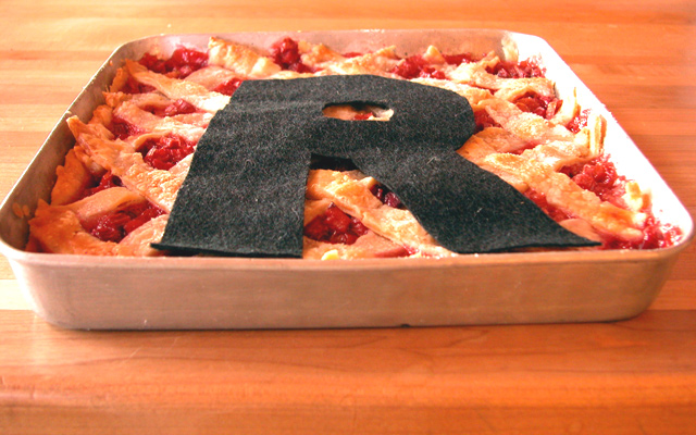
Hi Betty, I didn't vote this challenge (can't be everywhere!). I think people take their food a little too seriously around here! The "R" should have just peeled off easily, no fuss, no muss, no fuzz. Cropping - minor mistake....Lighting - a tad harsh.
(I got murdered over a hair in my Merange shot....geez, like I was going to serve that colored mess??? I washed it down the drain, please!)
Another really good CC critique! |
|
|
|
04/16/2003 06:10:04 PM |
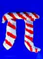
This is quite a creative idea for the interpretation of "Pi". Almost every school kid knows "Pi R Squared" and there have been many jokes made about it. You created a picture to match the words. I often find it hard to say that someone doesn't meet a challenge because the idea is that each photographer produces THEIR interpretation ... the question is whether a viewer can connect to that interpretation or not. In this case, I think your communication is loud and clear and, in my opinion, this meets the challenge quite well.
Now for some things which, in my opinion, could improve your photograph:
Composition: I personally would have cropped this picture differently. The left-to-right cropping is slightly unbalanced and the top-to-bottom cropping makes me feel that I'm bumping up against the top of the picture. I would like to see centered cropping left-to-right and to have some more "breathing room" at the top and sides of the photograph even at the expense of making the subject slightly smaller.
Technical: I see a focus problem here or maybe more like a depth of field problem. It looks like a delicious pie and I would like to relish it from front to back. I would like to see every flake of that crust and that requires a much greater depth of field. The right-hand side of the pan is "blown out" as well as the left, front corner. The "R" appears to be made of felt and I would like to see less detail in the material. These are distracting elements which generally can be corrected by exposure control. I have to agree with some of the comments, too, that the angle of the shot might have been better had the camera been at a higher angle to the subject. Notice that the "R", when viewed as a flat object (which it is in a photograph) is smaller at the top than at the bottom. A steeper angle would have moderated this effect.
Lighting: I don't know what your lighting source was but you might have used something like a white sheet to diffuse the light and make it more even. Except for the two hot spots I mentioned, it is pretty good.
So now that I've drooled over this photograph so long, I'm off to the kitchen to see what I can scrounge up ... I don't think I'll find anything as delicious as what you've portrayed, though. Thanks for sharing it with us.
Regards ... for the Critique Club,
Bob Mahan
(rmahan)
|
|
 Photographer found comment helpful. Photographer found comment helpful. |
Comments Made During the Challenge  |
|
|
04/12/2003 08:06:23 AM |
That looks so unappetising! Didn't you get fluff all through the pie?
A strange visual pun. It's not highly attractive as a photo. I like the camera angle and the lighting, but the subject matter is just corny. |
|
| Photographer found comment helpful. |
|
|
04/11/2003 11:59:04 AM |
| Clever and fun. I like the play on words. With this low point of view, you are still able to communicate the squarness of the pie. I kind of wish it were all in focus, though, or that the DOF could be even more out of focus, except for one spot. |
|
| Photographer found comment helpful. |
|
|
04/11/2003 09:05:18 AM |
| cute idea. I think that the fabric r wasn't such a great choice though. |
|
|
|
04/09/2003 06:54:39 AM |
|
|
|
04/08/2003 10:48:49 AM |
| Very sneaky play on words. If I did not know the challenge, I would not relate this without a lot of thinking. The cropping is a bit off and it is "off kilter" just a bit that it could be a bit distracting. The right side of the pan is blown out from the lighting |
|
| Photographer found comment helpful. |
|
|
04/07/2003 03:37:40 PM |
| Cherry Pi'd 2! Nice colour, good focus, good lighting too! Nice R square Pi, wonder how it tastes?? Nice overall photo. |
|
| Photographer found comment helpful. |
|
|
04/07/2003 12:54:35 PM |
| i think the idea is great and well executed (although an edible R would have been better). ideas for improvement - not so low of an angle, maybe picking a different surface that would distract less from the subject, better lighting. overall i had to laugh when i saw it and marvel at your creativity. |
|
| Photographer found comment helpful. |
|
|
04/07/2003 07:16:28 AM |
| Good job. Great idea...wish I'd thought of it |
|
|
|
04/07/2003 05:12:39 AM |
|
Home -
Challenges -
Community -
League -
Photos -
Cameras -
Lenses -
Learn -
Help -
Terms of Use -
Privacy -
Top ^
DPChallenge, and website content and design, Copyright © 2001-2025 Challenging Technologies, LLC.
All digital photo copyrights belong to the photographers and may not be used without permission.
Current Server Time: 04/09/2025 02:48:35 AM EDT.