| Author | Thread |
|
|
05/07/2005 11:09:59 PM |
*Critique Club*
Very nice portrait.
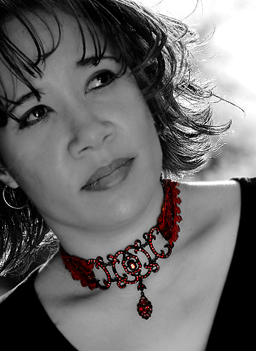
I love the backlighting that shines through her hair. In my opinion the lighting here is really good. No distracting hot spots or dark shadows and it's really pretty even throughout the photo.
I like the diffent angle you chose for this, and I think that the cropping is well done too. I like the diagonals.
The only thing that I keep coming back to that I might like to see differently is the positioning of the eyes. They seem to be looking just a bit too far to the right (her left). I wouldn't want to see them looking straight at the camera, but maybe just a bit more toward the camera would seem more natural. Maybe natural isn't the best word, but I hope you get my point.
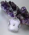
I love the selective coloring. Really draws the attention to the necklace. I think you did a really nice job with that and for me, that's what really makes the photo stand out.
I'm debating weather or not this would make an effective ad. While it is a really good portrait, I'm not sure if it would make me want to rush right out and buy this necklace. Where would the text go?
Focus and clarity are really good, and overall the image has high visual appeal to me and I would rate this well.
~Heather~ |
|
 Photographer found comment helpful. Photographer found comment helpful. |
Comments Made During the Challenge  |
|
|
05/01/2005 01:31:35 PM |
|
| Photographer found comment helpful. |
|
|
05/01/2005 08:18:20 AM |
| I like the idea, but it appears like the choker is a little dark on the sides. |
|
| Photographer found comment helpful. |
|
|
04/30/2005 08:43:16 AM |
| The red really stands out. |
|
| Photographer found comment helpful. |
|
|
04/29/2005 11:47:52 PM |
| well thoughtout and taken 10 |
|
| Photographer found comment helpful. |
|
|
04/29/2005 08:26:04 PM |
| Very kewl! I like the desaturation here. She has a great look too. Good luck. 7 |
|
| Photographer found comment helpful. |
|
|
04/29/2005 06:46:57 PM |
| Nice use of desaturation. This looks like it would be a great ad for a Univ. of Wisconsin, Madison school paper. 7 |
|
| Photographer found comment helpful. |
|
|
04/29/2005 04:24:11 PM |
| nice contrast between neck lace and b&w image |
|
| Photographer found comment helpful. |
|
|
04/29/2005 02:53:50 AM |
| Would like to see it all in color. not so good selec desat |
|
| Photographer found comment helpful. |
|
|
04/28/2005 12:43:42 PM |
| this is very nice...i feel like if i wore this piece of jewelry i might be in on the happy little secret the model has....very inviting and would make me want to look into the purchase of thispiece |
|
| Photographer found comment helpful. |
|
|
04/28/2005 12:23:12 PM |
| good use of colour on B&W |
|
| Photographer found comment helpful. |
|
|
04/28/2005 09:46:50 AM |
|
| Photographer found comment helpful. |
|
|
04/28/2005 05:43:35 AM |
| lovely display. i'm not a fan of selective desat but you have pulled off something special here. nice job |
|
| Photographer found comment helpful. |
|
|
04/28/2005 04:00:55 AM |
|
| Photographer found comment helpful. |
|
|
04/27/2005 05:51:19 PM |
| Very sharp - I like the selective desat |
|
| Photographer found comment helpful. |
|
|
04/27/2005 02:21:58 PM |
| Selective desaturation works well in this kind of advert. Good job. |
|
| Photographer found comment helpful. |
|
|
04/26/2005 06:14:06 PM |
good choice on the selective desaturation, it makes the picture man
If I said I gave you a 10, I wouldn't be lying. :-) |
|
| Photographer found comment helpful. |
|
|
04/26/2005 03:06:13 PM |
| I love the idea behind this image. You've focused the attention on the necklace with the color. The focus on the necklace needs to be just a little sharper to fully get the job done. |
|
| Photographer found comment helpful. |
|
|
04/26/2005 02:50:40 PM |
| The desat makes the Piece stand out nicely, but I'd like the jewelry to a stronger feature of the ad (I.E. larger, more detailed. |
|
| Photographer found comment helpful. |
|
|
04/26/2005 10:29:50 AM |
| sharp and crisp......back lighting nice.you highlighted the necklace well. |
|
| Photographer found comment helpful. |
|
|
04/26/2005 09:56:27 AM |
| I really like this. The selective desaturation is effectively used here. Great job. |
|
| Photographer found comment helpful. |
|
|
04/26/2005 09:31:42 AM |
| And you have done it expertly :) |
|
| Photographer found comment helpful. |
|
|
04/26/2005 08:55:10 AM |
| selective desat works on this photo and I like the crop |
|
| Photographer found comment helpful. |
|
|
04/25/2005 05:54:51 PM |
| Nice selective desaturation |
|
| Photographer found comment helpful. |
|
|
04/25/2005 02:39:43 PM |
| Cool jewel! Very unique and intriging. I'd wished for tighter crop to see the item better. don't need to see the model's shirt. Since this is threated as a portrait, a better focus on the model as well as the item coudl've been appreciated and some sharpening as well. more light as well on the item. ncie work tho. 6 |
|
| Photographer found comment helpful. |
|
|
04/25/2005 02:09:13 PM |
| Nice desat. I think for a Jewelry Advertisement I would have come in closer for more emphasis on the necklace. Good job on controlling the hot backlighting. |
|
| Photographer found comment helpful. |
|
|
04/25/2005 01:27:23 PM |
| nicely done great detail and love the colour red |
|
| Photographer found comment helpful. |
|
|
04/25/2005 01:08:25 PM |
Composition here is good. Not sure if her eyes looking in that direction work for this shot, as there is little area/space for her to be theoretically looking at.
Backlighting on her hair is casting a harsh appearance and makes it look oversharpened in these areas.
Perhaps a different focal point for her and/or a natural smile would have given more of a sense of ease in this shot.
The jewellery is well represented here. |
|
| Photographer found comment helpful. |
|
|
04/25/2005 09:27:48 AM |
| nice image. I like the selective coloring in this image. |
|
| Photographer found comment helpful. |
|
|
04/25/2005 06:53:28 AM |
|
| Photographer found comment helpful. |
|
|
04/25/2005 06:24:32 AM |
|
|
|
04/25/2005 05:35:51 AM |
| great photo, i love the colors and the necklace..looks great |
|
| Photographer found comment helpful. |
|
|
04/25/2005 02:31:36 AM |
| Nice image. Like the desat focus on the jewellery. Maybe missing a bit of sparkle?looks to be backlit - maybe another light source? |
|
| Photographer found comment helpful. |
|
|
04/24/2005 10:31:03 PM |
| Neat, I like the composition. |
|
| Photographer found comment helpful. |
|
|
04/24/2005 09:03:04 PM |
| would look great in a magazine. |
|
| Photographer found comment helpful. |
|
|
04/24/2005 08:49:26 PM |
| jewelry definetly stands out...nice lighting over shoulder...gl |
|
| Photographer found comment helpful. |
Home -
Challenges -
Community -
League -
Photos -
Cameras -
Lenses -
Learn -
Help -
Terms of Use -
Privacy -
Top ^
DPChallenge, and website content and design, Copyright © 2001-2025 Challenging Technologies, LLC.
All digital photo copyrights belong to the photographers and may not be used without permission.
Current Server Time: 04/07/2025 09:08:26 PM EDT.