| Author | Thread |
Comments Made During the Challenge  |
|
|
05/02/2005 09:15:03 PM |
|
|
|
05/01/2005 08:42:59 PM |
Technically, very good. Esthetically, not very interesting.
Still, better than average. |
|
|
|
04/30/2005 04:50:56 AM |
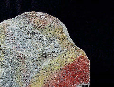
| I see a bird. I like the textures of the rock, but the subject of the photo doesn't do much for me. 5 |
|
|
|
04/29/2005 10:43:40 PM |
|
|
|
04/29/2005 11:30:15 AM |
| I feel this is a bit big, and the image shouldn't be 3/4 of the shot. |
|
|
|
04/29/2005 10:21:53 AM |
| Is that concrete? This image would benefit from better lighting and a more defined purpose. Sure there is red and yellow, but why should the viewer care? What questions does it pose? |
|
|
|
04/29/2005 10:16:19 AM |
| interesting use of theme, nice color, great texture, whites need work |
|
|
|
04/29/2005 02:30:36 AM |
| sharp photo, but how does it the challenge? |
|
|
|
04/28/2005 08:53:28 PM |
| I like the subtlty of this shot, and I like the high contrast background. |
|
|
|
04/28/2005 05:17:27 PM |
| what's mini in this one?? 1 |
|
|
|
04/27/2005 07:16:12 PM |
| This is about real estate, the subject taking the minority. |
|
|
|
04/27/2005 01:31:39 PM |
| I like the colors, although I don't think that the black background does much to enhance the subject. It also looks like maybe it was oversharpened a little bit too much. |
|
|
|
04/27/2005 08:49:09 AM |
| Lacks the simplicity and elegance I associate with minimalism, but nice all the same |
|
|
|
04/27/2005 03:10:24 AM |
| Not sure what red v yellow has to do with minimalism. Nice concrete though. |
|
Home -
Challenges -
Community -
League -
Photos -
Cameras -
Lenses -
Learn -
Help -
Terms of Use -
Privacy -
Top ^
DPChallenge, and website content and design, Copyright © 2001-2026 Challenging Technologies, LLC.
All digital photo copyrights belong to the photographers and may not be used without permission.
Current Server Time: 02/01/2026 11:54:33 AM EST.