| Author | Thread |
Comments Made During the Challenge  |
|
|
05/01/2005 10:04:50 PM |
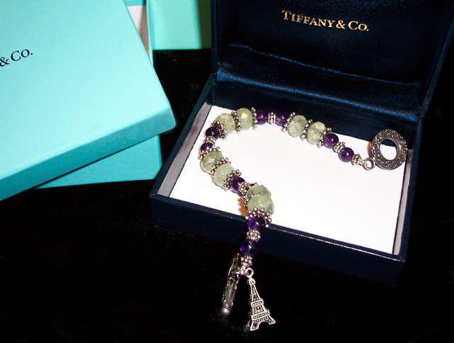
Overall a good theme and choice for composition lay-out.
In my opinion, the extreme light / dark is kind of hard on the eyes, and the light blue / turquoise clashes in this shot. (6) |
|
 Photographer found comment helpful. Photographer found comment helpful. |
|
|
05/01/2005 12:06:54 PM |
| The contrast from the jewelry and the white background is great, but at the same time the bright background spot is overpowering. |
|
| Photographer found comment helpful. |
|
|
04/30/2005 02:05:54 PM |
| Nice layout with the boxes, but your subject (the bracelet) is not displayed in an eye catching way. better to have kept it all in the box as the DOF isn't clear the way you have it now |
|
| Photographer found comment helpful. |
|
|
04/30/2005 03:42:22 AM |
|
| Photographer found comment helpful. |
|
|
04/29/2005 11:24:55 PM |
| A closer crop would have been nicer, with different lighting to make the jewels shine. |
|
| Photographer found comment helpful. |
|
|
04/29/2005 10:49:21 PM |
| Ooh la la! Simple and to the point. |
|
| Photographer found comment helpful. |
|
|
04/29/2005 01:56:07 PM |
| Closer crop on just the black box and contents (without the lightblue boxes) to bring us nearer to the piece would be better. Nice layout. |
|
| Photographer found comment helpful. |
|
|
04/29/2005 03:28:24 AM |
| I think that this photo would be more effective if the white card were removed from the box |
|
| Photographer found comment helpful. |
|
|
04/28/2005 09:12:56 PM |
| Closeup would have been better. There's not much detail this distance. |
|
| Photographer found comment helpful. |
|
|
04/28/2005 10:02:57 AM |
| That was a weird movie. JMO ;^) Nice piece of jewelry. I think it gets lost a bit with everything else in this image. Maybe just one box would have been better. One nitpick - there is some debris (dust) in the left front area of the navy box - should have got that. |
|
| Photographer found comment helpful. |
|
|
04/27/2005 03:02:25 PM |
| Nice box but what`s that in it :) |
|
| Photographer found comment helpful. |
|
|
04/26/2005 08:09:06 PM |
| Having the piece go from the black to the white makes it difficult to show the details. The ad itself is original and well centered. |
|
| Photographer found comment helpful. |
|
|
04/26/2005 02:00:23 PM |
| lovely piece of jewelry, but it is lost in the boxes. |
|
| Photographer found comment helpful. |
|
|
04/25/2005 06:25:02 PM |
| cute idea....but the display of the piece is a bit haphazzard for me ...good luck |
|
| Photographer found comment helpful. |
|
|
04/25/2005 04:33:17 PM |
| Nice idea. Composition is weak. |
|
| Photographer found comment helpful. |
|
|
04/25/2005 04:32:49 PM |
| Lucky dog!! who just happen to have tiffany boxes laying around?? lol good photo |
|
| Photographer found comment helpful. |
|
|
04/25/2005 03:14:50 AM |
|
| Photographer found comment helpful. |
|
|
04/25/2005 01:51:50 AM |
| A little out of focus, but a very nice shot. |
|
| Photographer found comment helpful. |
|
|
04/25/2005 01:46:41 AM |
| white bottom of box needs silk?or? focus is nice |
|
| Photographer found comment helpful. |
|
|
04/25/2005 01:09:19 AM |
| Shadow is distracting, try softer light source. |
|
| Photographer found comment helpful. |
Home -
Challenges -
Community -
League -
Photos -
Cameras -
Lenses -
Learn -
Help -
Terms of Use -
Privacy -
Top ^
DPChallenge, and website content and design, Copyright © 2001-2026 Challenging Technologies, LLC.
All digital photo copyrights belong to the photographers and may not be used without permission.
Current Server Time: 02/01/2026 10:29:09 AM EST.