| Photograph Information |
Photographer's Comments |
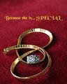
Challenge: Jewelry Advertisement (Advanced Editing IV*)
Camera: Canon EOS-350D Rebel XT
Lens: Canon EF 100mm f/2.8 USM Macro
Location: Office
Date: Apr 23, 2005
Aperture: f 8.0
ISO: 100
Shutter: 13 sec
Galleries: Macro, Advertisement
Date Uploaded: Apr 23, 2005
|
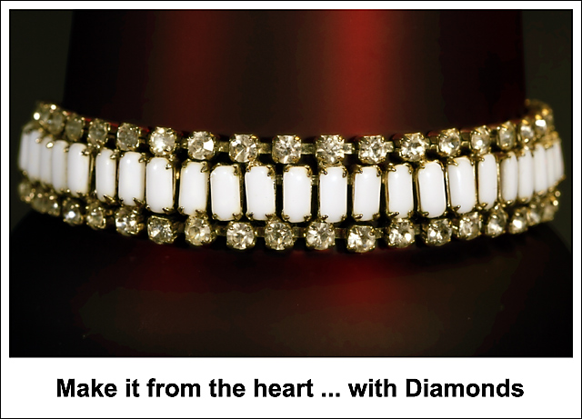
This jewelry came from my mother-in-law; it’s been around for a very long time. I wanted to keep this simple so I put the bracelet on a Travel Coffee Mug that changes from black to red in different light. This was perfect to put the bracelet on and I think it worked out well in this case; I personally don’t like jewelry on white/light background. Well guess we will see what happens.
About the lighting... quite simple ... I had my office overhead light on for about a one second or two and turned that off completely. In the pitch dark room I used my 580EX flash by hitting the Test/Pilot light to flash it 3 times from front, then left side and finally the right... fun stuff.
PS: RAW WB, Hue, Brightness adjustment and convert to JPG, Auto Curves, Auto Contrast, Gaussian Blur, Curves (per channel adjustment), different layer modes, History Brush, Canvas Size with White, Crop, Type Tool, Size, USM. |
| Author | Thread |
Comments Made During the Challenge  |
|
|
05/01/2005 12:16:03 AM |
As I sat here looking at this shot, I struggled to figure out what it was that was so different about it then it suddenly hit me - the white border/framing.
This is a case of the border/framing actually working for the shot instead of against it. An advertisement would/could look very similar to this kind of lay out.
Composition is decent and the red in the background adds dimension instead of the jewelry floating in space. Overall, a pretty good take on the challenge. (6)
|
|
 Photographer found comment helpful. Photographer found comment helpful. |
|
|
04/29/2005 07:36:16 PM |
| Good job ... I just wish those diamonds were shining! |
|
| Photographer found comment helpful. |
|
|
04/29/2005 06:05:08 PM |
| I like the detail and background color in this very much. The composition is static.The ad copy might have been on in the image with a different font and light color. |
|
| Photographer found comment helpful. |
|
|
04/28/2005 09:23:19 PM |
| Good use of color and good control of the reflections |
|
| Photographer found comment helpful. |
|
|
04/28/2005 02:31:39 PM |
| I would have liked a slightly larger depth of field, but this still works. Like the interesting red strip in the background. |
|
| Photographer found comment helpful. |
|
|
04/27/2005 04:54:25 PM |
| Interesting piece of jewelry. A little sparkle on the diamonds would have improved the shot immensely. |
|
| Photographer found comment helpful. |
|
|
04/27/2005 09:33:17 AM |
| thou shalt not use times new roman for design... i dont really like the border. composition is a bit akward, would have like the bracelet more anchored, right now it seems like its floating in space. i like the backdrop and how you captured the diamonds. |
|
| Photographer found comment helpful. |
|
|
04/27/2005 07:29:43 AM |
| Ho-hum. Technically it's fine, just lacking something in the creativity department. I think it's the text outside the image in a plain white border that pulls the attention away from what is otherwise a nice image. It's like a MS Word document with a table and an image inserted with text put under it. Sorry if this comes across the wrong way...really. I like the image - just the total package isn't jumping out at me. |
|
| Photographer found comment helpful. |
|
|
04/26/2005 04:29:21 PM |
| I don't get it The shadows are great but the DOF and focus are not effective. comp is good. |
|
| Photographer found comment helpful. |
|
|
04/26/2005 03:33:45 PM |
| presentation is uninteresting |
|
|
|
04/26/2005 08:20:06 AM |
| Very beautiful! You did a good job on this! |
|
| Photographer found comment helpful. |
|
|
04/25/2005 11:25:02 PM |
this image seems to need a boost as it appears slightly flat
good focus but not sharp as it should be
|
|
| Photographer found comment helpful. |
|
|
04/25/2005 07:10:28 PM |
| This is quite nice, I love whatever it is that you used as a background that gives the dark red/burgundy color, and the lighting on the diamonds is quite nice too. Well done! |
|
| Photographer found comment helpful. |
|
|
04/25/2005 09:13:03 AM |
| Interesting piece of jewelry. simply displayed. good photo. |
|
| Photographer found comment helpful. |
|
|
04/25/2005 07:18:08 AM |
| I like the DOF but their appears to be banding on the graident on the braclet holder. Not sure if they was because of the small file size req. I still gave it a 7. |
|
| Photographer found comment helpful. |
|
|
04/24/2005 10:21:12 PM |
| somehow this layout makes me think "teeth"...rest I like...angle bracelet while rest is squared?...nice color use...8 |
|
| Photographer found comment helpful. |
|
|
04/24/2005 08:33:11 PM |
| Love the background in this image, the diamonds are sharp and clear without being over done. Well done! |
|
| Photographer found comment helpful. |
Home -
Challenges -
Community -
League -
Photos -
Cameras -
Lenses -
Learn -
Help -
Terms of Use -
Privacy -
Top ^
DPChallenge, and website content and design, Copyright © 2001-2025 Challenging Technologies, LLC.
All digital photo copyrights belong to the photographers and may not be used without permission.
Current Server Time: 04/08/2025 01:48:56 AM EDT.