| Author | Thread |
Comments Made During the Challenge  |
|
|
05/01/2005 11:23:20 AM |
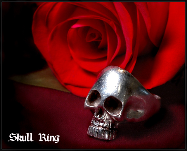
| I love the contrast between the skull and the rose. Nice work. |
|
 Photographer found comment helpful. Photographer found comment helpful. |
|
|
05/01/2005 10:36:52 AM |
| While I don't care for the ring, you've created a tremendously appealing photo advertisement. Use of lighting, vignetting, shadows is just excellent. Very well done! |
|
| Photographer found comment helpful. |
|
|
04/30/2005 05:16:14 AM |
| this is a very balanced photo |
|
| Photographer found comment helpful. |
|
|
04/30/2005 02:50:45 AM |
| the hot spot detracts from a very nice image,. BTW if you paint the metal with Milk it helps soften the hot spots. 7 |
|
| Photographer found comment helpful. |
|
|
04/29/2005 11:57:46 PM |
| Like it,but the only thing that bothers me its a shines on the ring, 8 |
|
| Photographer found comment helpful. |
|
|
04/29/2005 11:08:30 AM |
| Nice juxtaposition of this symbol of death next to a symbol of life/love. IMO Light is too hot on the skull of the skull. All the best. |
|
| Photographer found comment helpful. |
|
|
04/29/2005 08:49:27 AM |
| Nice composition and lighting. I just wonder what the brown is under the rose because my eye is being drawn to it. |
|
| Photographer found comment helpful. |
|
|
04/29/2005 07:57:14 AM |
|
| Photographer found comment helpful. |
|
|
04/29/2005 04:03:31 AM |
Beauty & the Beast approach!
Nice composition, with the rose taking a bit too much of the focal point in my opinion.
Lighting overall is good, with only a small area blown out on the forehead of the skull. (5) |
|
| Photographer found comment helpful. |
|
|
04/28/2005 10:17:56 PM |
| I like the positioning and the elements in this one, well done |
|
| Photographer found comment helpful. |
|
|
04/28/2005 08:53:22 PM |
| A tad bright in the middle of the rings forhead, but I like the shot. |
|
| Photographer found comment helpful. |
|
|
04/28/2005 06:43:38 PM |
| Love the rose! Even more than the jewelry. The lighting on it is so perfect. Unfortunately I dont like the hot spot on the forehead of the skull. |
|
| Photographer found comment helpful. |
|
|
04/28/2005 12:43:30 AM |
| the blown out highlight is a shame. That's the challenge of course! |
|
| Photographer found comment helpful. |
|
|
04/27/2005 03:33:54 PM |
| The ring looks well used. |
|
| Photographer found comment helpful. |
|
|
04/27/2005 01:01:30 PM |
| clean and simple. I doesn't scream brilliant, but more like "well done". |
|
| Photographer found comment helpful. |
|
|
04/26/2005 08:57:30 PM |
| Nice shot, nice font and shaodows. The comp needs to leave more room for text and the skull ring need to be sharper. |
|
| Photographer found comment helpful. |
|
|
04/26/2005 08:52:47 PM |
| Love the picture and focus on the ring and rose. I wish the eye sockets had some gems in them but heck no fault of yours. I gave you a 7. |
|
| Photographer found comment helpful. |
|
|
04/26/2005 02:43:41 PM |
| better if you tone down hotspot with photo-editor (or use more diffuse light) |
|
| Photographer found comment helpful. |
|
|
04/26/2005 11:53:38 AM |
| The reds somehow don't get along with each other, to me. Good lighting. |
|
| Photographer found comment helpful. |
|
|
04/26/2005 07:56:19 AM |
| The glare on the ring is too much, imho, and the text font distracts, rather than adds. |
|
| Photographer found comment helpful. |
|
|
04/26/2005 04:40:34 AM |
| Overall the lighting is good, but the highlight on the skull is a bit too much for me. Composition is really good. |
|
| Photographer found comment helpful. |
|
|
04/25/2005 11:37:54 PM |
| I like the composition of this shot, though the glare of the forehead of the skull distracts from the rest of the image in my opinion. |
|
| Photographer found comment helpful. |
|
|
04/25/2005 06:49:00 PM |
| This looks like a lagit ad. Well done. |
|
| Photographer found comment helpful. |
|
|
04/25/2005 06:28:18 PM |
| Nice idea. Sort of creapy with the Rose, but definatly intriging. The frame and composition are very good, but the lighting is a bit off. Too strong on the ring, too soft on the rose. I'm not too keen on the 'set' either, with the brown part of fabric. On an even set, this would've done better. Some water sparkles on the rose trick could've done some good results on this shot. Font is good and not too invasive. Feels like a 'tatoo-shop' picture. 6 |
|
| Photographer found comment helpful. |
|
|
04/25/2005 05:56:28 PM |
| i loved this!!!!!putting thr hardness of a skull together with the softness of the rose....great contrast and yet warmth......"8" |
|
| Photographer found comment helpful. |
|
|
04/25/2005 01:25:22 PM |
| Nice to see something out of the ordinary in this challenge. Well photographed. |
|
| Photographer found comment helpful. |
|
|
04/25/2005 10:54:10 AM |
| Nice. I like it. Very interesting piece of jewelry. Good choice of text, the composition and focus is very good. Only issue I have is the lighting. I wish the light could have been difused some to eliminate the hot spot on the skull ring forehead. Good job, and good luck. |
|
| Photographer found comment helpful. |
|
|
04/25/2005 10:08:08 AM |
| Nice balance. The light just seems a little bright on the skull. |
|
| Photographer found comment helpful. |
|
|
04/25/2005 07:15:43 AM |
| I like this, but ... a SKULL??? :) KInda has that love to the death feel. |
|
| Photographer found comment helpful. |
|
|
04/25/2005 01:38:12 AM |
| If not for that excessively bright glare, I would have really loved this. Great job overall - just need to subdue the lighting. |
|
| Photographer found comment helpful. |
|
|
04/25/2005 12:39:03 AM |
| this one didn't need the text... |
|
| Photographer found comment helpful. |
Home -
Challenges -
Community -
League -
Photos -
Cameras -
Lenses -
Learn -
Help -
Terms of Use -
Privacy -
Top ^
DPChallenge, and website content and design, Copyright © 2001-2026 Challenging Technologies, LLC.
All digital photo copyrights belong to the photographers and may not be used without permission.
Current Server Time: 02/01/2026 09:16:39 AM EST.