| Author | Thread |
Comments Made During the Challenge  |
|
|
05/01/2005 07:07:42 AM |
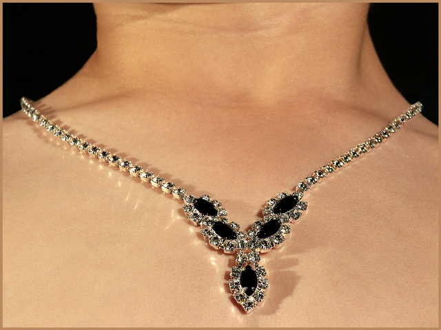
| I think the lighting here is too harsh, as it casts some odd shadows and makes many hot spots of the jewelry. Granted, it also casts some interesting reflections on your model's skin. |
|
|
|
05/01/2005 06:44:34 AM |
| cutting themodel's head off is not usually a good plan....and I'm afraid the shadow reduces the impact a lot. Focus is good |
|
|
|
04/30/2005 07:16:44 PM |
| Something "bothers" me about the crop/composition; maybe crop more off the top? |
|
|
|
04/30/2005 04:29:17 PM |
| I felt I would have rather seen more of the bigger stones in more detail, but thats just me. |
|
|
|
04/30/2005 11:02:54 AM |
| Great idea and composition, but the lighting isn't working for something to be in a print ad. Too much shadow from the left, and the stones are turned on the left side too. The best thing about this shot is the lovely skin tones! |
|
|
|
04/29/2005 10:52:29 PM |
| simple and effective image 7 |
|
|
|
04/29/2005 02:37:32 PM |
| I think you should have had a second light from the right side. And seeing so much of the neck is unecessary. |
|
|
|
04/28/2005 06:12:41 PM |
| Excellent skin tones and reflections |
|
|
|
04/28/2005 10:05:26 AM |
| I'm not sure about the reflection on the skin? and perhaps a bit of cleaning up on the stretch lines would add more effect. 6 |
|
|
|
04/28/2005 09:42:13 AM |
| Lighting is very interesting, as it gives good sparkly reflection on the skin. Unfortunatly the composition is not very interesting; no features, no movement, could've been a plastic doll. Also the composition is not even, which bugs my eyes some (two black spots on each sides). 5 |
|
|
|
04/28/2005 08:45:37 AM |
| I don't know what to say; I think it's uninteresting that you croped the head of your model. It's not very esthetic to chop someone's head. If you only wanted to photograph the neckless, you would have benn better putting it on a flat surface. |
|
|
|
04/28/2005 06:02:32 AM |
| Nice piece of jewelry. How did you get the reflective sparkle off of natural skin? That's very cool. IMO this would have worked a little better if it had been cropped to exclude most of the neck. |
|
|
|
04/27/2005 05:19:35 PM |
| Nice presentation idea, but the shadow is distracting. |
|
|
|
04/27/2005 02:26:11 PM |
| Nice shot of the necklace but the angle looks a bit odd. I think it might be better taken straight on as opposed to from below. |
|
|
|
04/27/2005 11:27:12 AM |
| Lighting a bit harsh but jewelry looks good. |
|
|
|
04/27/2005 12:35:27 AM |
| I'm not sure if the composition is too centered or not, and honestly don't know what to suggest one way or another. Detail is great, but the reflections on the skin kinda' distract. Multiple (and soft) light sources would have helped here. A simple, white border may have been a litle more effective too. (7) |
|
|
|
04/26/2005 10:42:11 AM |
| reflections on skin are a little disconcerting (makes skin look fake)... I think I might have edited those out. |
|
|
|
04/26/2005 09:00:19 AM |
| Very well done. I like the way the diamonds sparle on her skin. |
|
|
|
04/25/2005 09:31:26 AM |
| the reflection on the skin is quite interesting, how did you acheive that? |
|
|
|
04/25/2005 05:22:51 AM |
| great lighting. Nice shine on the gems. I'd have perhaps cropped the top just slightly lower, 1/3 inch more or so, to really put the focus on the necklace. |
|
|
|
04/24/2005 09:50:47 PM |
| Very nice. Except cannot tell what gems are in the middle. |
|
|
|
04/24/2005 09:36:00 PM |
| nice necklace I would have liked to see the models head as well but nice work |
|
|
|
04/24/2005 09:09:39 PM |
|
|
|
04/24/2005 08:24:21 PM |
| the angle makes the neck look too big and flat in the front.. |
|
Home -
Challenges -
Community -
League -
Photos -
Cameras -
Lenses -
Learn -
Help -
Terms of Use -
Privacy -
Top ^
DPChallenge, and website content and design, Copyright © 2001-2025 Challenging Technologies, LLC.
All digital photo copyrights belong to the photographers and may not be used without permission.
Current Server Time: 04/07/2025 01:04:07 AM EDT.