| Author | Thread |
|
|
05/05/2005 03:44:18 AM |
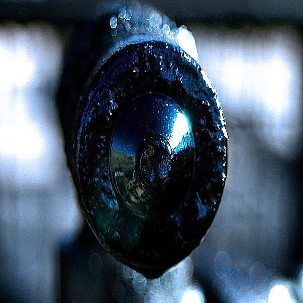
ok, when this popped up in the random photo thread, i thought i recognized it, but was looking at it as a standalone image (as opposed to a challenge entry). my initial reaction was "interesting colors, but a little too in-your-face, without enough detail to be able to come to terms with the subject comfortably." so, if that is what you were after, you succeeded. if you just wanted to see how close in you could get and still have something in focus, you succeeded there, as well. and if you were experimenting with color and bokeh, you also did well.
as far as a challenge entry goes, i scored it a 4. i didn't think it met the challenge very well, nor did i find it that appealing or interesting. if it hadn't been so centered, i probably would have scored it a 5. but, as it was, i didn't see anything more to hold my interest. |
|
 Photographer found comment helpful. Photographer found comment helpful. |
Comments Made During the Challenge  |
|
|
04/30/2005 07:14:10 PM |
|
|
|
04/29/2005 06:57:57 PM |
| After 1 minutes starring at the picture, I still can't tell what I am looking at. Looks blurry also. |
|
|
|
04/29/2005 05:58:39 PM |
| Very interesting play of light and shadows, but it feels a little too busy to meet the challenge description, and the main subject takes up a lot of space. |
|
|
|
04/29/2005 06:38:13 AM |
| What is that? With some context this could have much potential. Though I think the main subject is taking up too large a portion of the image. |
|
|
|
04/28/2005 05:32:33 PM |
| I am unable to know what this is.... |
|
|
|
04/28/2005 01:15:05 PM |
| im very confused with this one, fix the title, and too big and sharpening doesn't help.1 |
|
|
|
04/28/2005 05:56:57 AM |
|
|
|
04/27/2005 03:19:13 PM |
no idea what i'm looking at
i find the 'dots' at the top and botom of the image to be distracting (though pretty)
|
|
|
|
04/27/2005 02:17:15 PM |
| Subject is way to large for this challenge, cool dof though |
|
|
|
04/27/2005 10:01:52 AM |
| I feel this image had a central subject that occupied a small portion of the image. |
|
|
|
04/27/2005 09:42:33 AM |
| There are a lot of things I like about this photo, but I can't quite put my finger on them. Mostly it's the mood and composition. That said, though, I think the subject takes up far too much of the frame for minimalism and the focus isn't quite sharp. But, as I said, I like it from an artistic standpoint. |
|
|
|
04/27/2005 04:54:27 AM |
| Why does this feel squashed ? |
|
|
|
04/27/2005 03:03:54 AM |
| "Create an image where your subject is the strong point of the image, but only occupying a very small portion of the image space." I think you did "MACRO" |
|
|
|
04/27/2005 12:44:28 AM |
| I have no idea what this is supopsed to be, and the blown highlight on the reflected glare is harsh and distracting. |
|
Home -
Challenges -
Community -
League -
Photos -
Cameras -
Lenses -
Learn -
Help -
Terms of Use -
Privacy -
Top ^
DPChallenge, and website content and design, Copyright © 2001-2025 Challenging Technologies, LLC.
All digital photo copyrights belong to the photographers and may not be used without permission.
Current Server Time: 04/09/2025 06:10:46 PM EDT.