| Author | Thread |
Comments Made During the Challenge  |
|
|
05/01/2005 06:13:22 PM |
Nice colors. Shadow her is a major distractioninmy opinion.
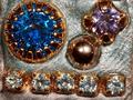
The overall size of the image is on the smaller size at 432x213 pixels. The file size is also very small (27K), which will hurt it's overall quality.
We are allowed 640 pixels on the longest side, and up to 150K. Using as much of the 150K as possible will only help to not compress the image. If you need help in understanding or making these happen, please don't hesitate to PM me and I can give you some pointers. (5) |
|
|
|
04/30/2005 10:09:10 AM |
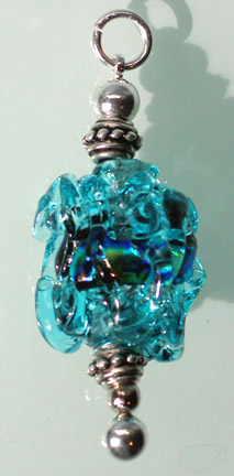
| blurry and bent, this photo would not be print ad quality |
|
|
|
04/29/2005 04:48:19 AM |
| Interesting bead, but the soft focus and harsh lighting make this photo unappealing. |
|
|
|
04/29/2005 12:27:55 AM |
| I think that you may have been better to present the image on an angle thus making a larger image |
|
|
|
04/28/2005 05:10:08 AM |
| Composition and placement are uninteresting. Hard shadow not esthetic at all. |
|
|
|
04/27/2005 07:14:35 PM |
| Having the strong lighting is good, but the harsh shadow is not so good. Either a reflector to shine some light behind the bead to reduce the shadow, or selectively lightening the shadow would help. |
|
|
|
04/25/2005 10:29:39 PM |
| this image is a bit too small to really judge |
|
|
|
04/25/2005 05:07:13 PM |
| the shadow is distracting |
|
|
|
04/25/2005 02:50:58 AM |
| small & bottom is blurry. Lighting is casting a very strong, distracting shadow. - hope you overcome the likely low score and continue to participate and improve. |
|
|
|
04/24/2005 10:27:12 PM |
| Glass section seems to be out of focus. Glass is hard to work with. |
|
|
|
04/24/2005 10:17:37 PM |
| you could have done this one without a shadow - it only takes away, adds nothing pretty to the otherwise good photo. |
|
|
|
04/24/2005 10:03:48 PM |
| how unique...I would love to have this!!! |
|
|
|
04/24/2005 09:52:28 PM |
| lovely colors and reflection...think those of us that didn't add slogan and fonts should have...gl...7 |
|
|
|
04/24/2005 09:04:15 PM |
| The subject appears very "busy" to me; perhaps a different subject could have helped.... The shadow doesn't really add either. It could use some sharpening too. good luck. |
|
Home -
Challenges -
Community -
League -
Photos -
Cameras -
Lenses -
Learn -
Help -
Terms of Use -
Privacy -
Top ^
DPChallenge, and website content and design, Copyright © 2001-2025 Challenging Technologies, LLC.
All digital photo copyrights belong to the photographers and may not be used without permission.
Current Server Time: 04/08/2025 08:06:01 AM EDT.