| Author | Thread |
|
|
05/25/2005 01:25:01 AM |
| Woa, this is way underrated. Nice dramatic effect. (I didn't vote, unfortunately). |
|
 Photographer found comment helpful. Photographer found comment helpful. |
|
|
04/27/2005 12:36:53 PM |
| Great vision brought out; I love this one. |
|
| Photographer found comment helpful. |
Comments Made During the Challenge  |
|
|
04/26/2005 02:03:02 PM |
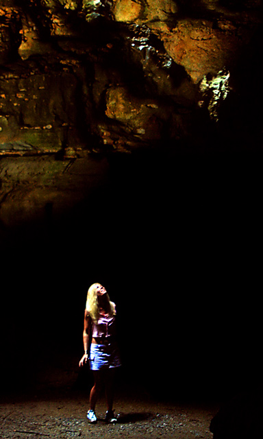
| So dark that nobody can see the toilet paper :) |
|
| Photographer found comment helpful. |
|
|
04/25/2005 04:19:45 PM |
|
| Photographer found comment helpful. |
|
|
04/25/2005 01:39:56 PM |
| I like the lighting on the girl. Good Job |
|
| Photographer found comment helpful. |
|
|
04/24/2005 08:31:00 PM |
| this is too harsh looking for my tastes, in general it is underexposed. |
|
| Photographer found comment helpful. |
|
|
04/24/2005 01:49:41 PM |
| Lighting must have been tough in this one. She looks overexposed/burned out to me, but the cave walls look pretty good.[8] |
|
| Photographer found comment helpful. |
|
|
04/24/2005 02:43:31 AM |
| Overexposed? Out of focus also. Looks like a great place for taking photo's. |
|
| Photographer found comment helpful. |
|
|
04/22/2005 10:48:54 PM |
| It seems likethere are Light issues but looks like a beautiful spot |
|
| Photographer found comment helpful. |
|
|
04/21/2005 02:28:39 PM |
| Great lighting. I like how the image is split in two parts. But it looks overedited: too much contrast, and the woman is out of focus, or so it seems. Might be a postprocessing matter as well. 7. |
|
| Photographer found comment helpful. |
|
|
04/21/2005 11:06:19 AM |
| This would have looked great for the minimal challenge! Hope you do well, one of the best i've seem thus far. |
|
| Photographer found comment helpful. |
|
|
04/21/2005 09:29:45 AM |
| nice lighting, i like how the girl is lit up and how everything else fades to black |
|
| Photographer found comment helpful. |
|
|
04/20/2005 08:08:04 PM |
| hmm... scissors and paper? |
|
| Photographer found comment helpful. |
|
|
04/20/2005 03:52:42 PM |
| Great idea, but, I wish she was a bit sharper. The lighting up at the top is intriguing. |
|
| Photographer found comment helpful. |
|
|
04/20/2005 12:53:00 PM |
too much noise & saturation on the woman.
The lighting is interesting but it's hard to make out whhere the light is coming from , what's behind here, and what she's looking up at. |
|
| Photographer found comment helpful. |
|
|
04/20/2005 11:56:06 AM |
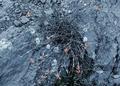
| It looks more like the girl was the focus of this, and not the rocks. |
|
| Photographer found comment helpful. |
Home -
Challenges -
Community -
League -
Photos -
Cameras -
Lenses -
Learn -
Help -
Terms of Use -
Privacy -
Top ^
DPChallenge, and website content and design, Copyright © 2001-2026 Challenging Technologies, LLC.
All digital photo copyrights belong to the photographers and may not be used without permission.
Current Server Time: 02/01/2026 11:47:06 AM EST.