| Author | Thread |
|
|
04/29/2005 12:57:43 AM |
Thanks to sabphoto for the most useful comments.
Some additional notes:
I wrote up a post-mortem on this entry with more detail on what I learned and what I should have entered, but there were a few things I should note about some of the comments that were made.
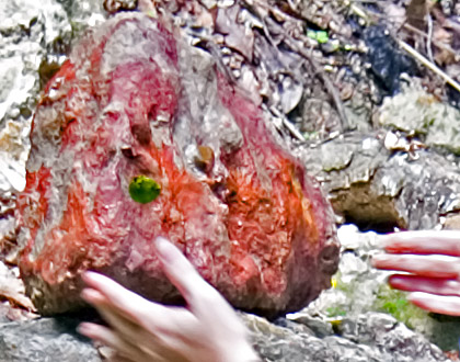
The shot wasn't originally of the rock itself, but of someone setting up the rock to take a picture of it. I was contemplating concepts that might work for my first DPChallenge submission and ended up choosing that photo and one other for having interesting rocks, then picked the colorful rock over the other shot that was technically much superior, but seemed more commonplace:

I liked that the hands were blurry because it fit the general idea of dodging a dropped rock (rock breaks fingers). Same with the floating fingers. Even if I had wanted to go with full hands, I wouldn't have had much room to move, though: the area to the left of the rock was very distracting, and the camera was visible just off the right side of the crop. I could have added room above or below, but there wasn't anything interesting. Thus, I also couldn't get up any larger. The shot just wasn't close enough.
Because I never ended up comparing the shot at the proper resolution to others I've taken (the thumbnail looked okay, and although it did look off when I viewed it full screen, I originally attributed that just to scaling), I didn't realize how bad it was. I thought it was just a touch on the off side until I actually saw it in place, and by then it was too late.
Also, we really do get bright mud and rocks in Louisiana. One person actually uses some of the muds mixed with egg as pigment for his paintings. |
|
Comments Made During the Challenge  |
|
|
04/26/2005 03:42:04 PM |
Please allow me to offer some possible help with your image.
First it is too small, 640 is the biggest any side can be so use it, if you went smaller due to the mb issue then learn about compression and do it in small amounts till you get past the allowed level.
The hands are blurry, try and make sure they stay still when shooting, unless this is an action shot it really distracts from the overall image.
The hands are both cut off at bad places leaving floating fingers...try to re-position them to get more of the hand, maybe even moving back to include more space to get them in.
Your crop is way too tight. Leave room, this may have helped with the hands as mentioned above.
Nothing is really sharply in focus.
I do like that you didn't go with the traditional scissors cut paper, rock crushes scissors photo like most did, that shows you do think out of the box and have some creativity, hope my suggestions can help. |
|
 Photographer found comment helpful. Photographer found comment helpful. |
|
|
04/26/2005 10:53:42 AM |
|
| Photographer found comment helpful. |
|
|
04/26/2005 04:03:34 AM |
| just cant make out what u r trying to depict! |
|
| Photographer found comment helpful. |
|
|
04/26/2005 01:56:53 AM |
| I wish the image were clearer so I could see what was going on. |
|
| Photographer found comment helpful. |
|
|
04/24/2005 09:36:47 PM |
|
|
|
04/24/2005 11:31:51 AM |
| Too blurry and unclear. Your title trys to explain your photo but the poor quality of the image doesn't lead to understanding |
|
| Photographer found comment helpful. |
|
|
04/24/2005 11:10:43 AM |
| sorry, the picture doesn't do it for me |
|
|
|
04/24/2005 09:39:01 AM |
|
| Photographer found comment helpful. |
|
|
04/24/2005 09:11:26 AM |
| Out of focus. Hope no fingers were hurt in the making of this photo. |
|
| Photographer found comment helpful. |
|
|
04/24/2005 07:54:57 AM |
very blurred and i don't get any sense of movement from it.. its just blurred
also use the 640 pixels you can |
|
| Photographer found comment helpful. |
|
|
04/24/2005 02:34:50 AM |
| focus and contrast not where it should be |
|
| Photographer found comment helpful. |
|
|
04/23/2005 09:48:22 PM |
| Really blurry. Too bad about your finger. |
|
|
|
04/22/2005 10:53:04 AM |
| background is a little to busy, w/o title didn't get the green thing |
|
| Photographer found comment helpful. |
|
|
04/21/2005 08:34:56 AM |
| way out of focus, probably wouldve been a great photo |
|
| Photographer found comment helpful. |
|
|
04/20/2005 09:12:01 PM |
| Can I suggest that with your next entry you try a larger picture. |
|
| Photographer found comment helpful. |
|
|
04/20/2005 04:13:54 PM |
| This photo needs to be larger and much sharper. Looks like too slow a shutter speed. |
|
| Photographer found comment helpful. |
|
|
04/20/2005 01:59:53 PM |
| Out of focus (I know it's motion blur on the hands). I can't really tell what it is I'm supposed to be looking at. Where is the focal point of the composition? |
|
| Photographer found comment helpful. |
|
|
04/20/2005 12:53:50 PM |
| too noisy and the colors are unrealistic. |
|
|
|
04/20/2005 06:04:23 AM |
| Perhaps this was the effect that you were going for, but the shot seems too blurry, with no real focal point. |
|
| Photographer found comment helpful. |
|
|
04/20/2005 12:57:17 AM |
| i don't even know what this is =). but there's too many things going on that it's distracting. sorry. |
|
| Photographer found comment helpful. |
Home -
Challenges -
Community -
League -
Photos -
Cameras -
Lenses -
Learn -
Help -
Terms of Use -
Privacy -
Top ^
DPChallenge, and website content and design, Copyright © 2001-2026 Challenging Technologies, LLC.
All digital photo copyrights belong to the photographers and may not be used without permission.
Current Server Time: 02/01/2026 11:48:52 AM EST.