| Author | Thread |
|
|
04/28/2007 01:54:12 PM |
| couldn't get up from the work desk? |
|
|
|
04/13/2003 05:41:41 PM |
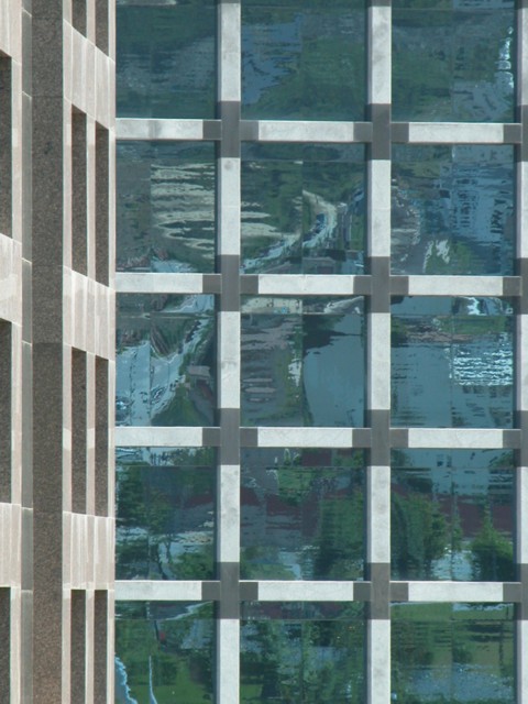
Critique Club Comment:
I think that you have a nice vertical symmetry here. I don't think that all symmetry photo's need to be in landscape mode. I like your subject matter as well. You do suffer from having to take the photo from street level which introduces some interesting angles, but it's not enough to lessen the impact of your shot. I think that boosting the contrast would assist this photo. As it stands now, it's kind of flat. Cropping could be a little tighter. The building has natural crop points and if you used the bottom and top window lines, still including the building on the left, I think you'd have a stronger composition.
Your post processing is good, no artifacts from compression or resize.
I like this image, I would like to see a reshoot with the sun lower in the sky so as to introduce some more interesting colors and shadows. |
|
Comments Made During the Challenge  |
|
|
04/06/2003 09:24:29 AM |
| That's very cool. I like the way the buildings almost line up... but then don't... but then do again. Fabulous. Really great shot. |
|
|
|
04/04/2003 06:25:53 AM |
| Nice subject, but seems perhaps a little overexposed? Perhaps some tweaking in PS would help. Like the reflections. |
|
|
|
04/04/2003 12:49:02 AM |
This photo needs more contrast for sure. I'm not really seeing the symmetry part either. If it were supposed to be the windows, I'd have cropped off the side of the building on the left.
|
|
|
|
04/02/2003 12:11:48 AM |
| I don't really get symmetry from this, but the photo does have a good balance, and a pleasing composition. The colors are all soft and muted, and while I find it to be a nice photo, it lacks real impact for me. |
|
|
|
04/01/2003 05:56:51 PM |
| Soft focus works well here. The distortion and colors are nice. |
|
|
|
03/31/2003 12:31:00 PM |
| Monet would be proud of this. |
|
|
|
03/31/2003 08:33:34 AM |
| Nice image. I like the different patterns and colors in the photo. Good job. |
|
|
|
03/30/2003 08:37:23 PM |
| I think this would look better if it extended more to the right (more squares). |
|
 Photographer found comment helpful. Photographer found comment helpful. |
Home -
Challenges -
Community -
League -
Photos -
Cameras -
Lenses -
Learn -
Help -
Terms of Use -
Privacy -
Top ^
DPChallenge, and website content and design, Copyright © 2001-2025 Challenging Technologies, LLC.
All digital photo copyrights belong to the photographers and may not be used without permission.
Current Server Time: 04/12/2025 03:42:04 PM EDT.