| Author | Thread |
Comments Made During the Challenge  |
|
|
04/26/2005 05:38:39 PM |
|
|
|
04/26/2005 03:34:59 PM |
|
|
|
04/26/2005 02:01:40 PM |
| Nice picture, but too small. |
|
 Photographer found comment helpful. Photographer found comment helpful. |
|
|
04/26/2005 01:53:47 PM |
|
| Photographer found comment helpful. |
|
|
04/26/2005 04:36:34 AM |
| TOO SMALL! such a shame as I like the colour combination. Good luck with future challenges |
|
| Photographer found comment helpful. |
|
|
04/24/2005 05:14:58 PM |
|
|
|
04/24/2005 03:14:41 PM |
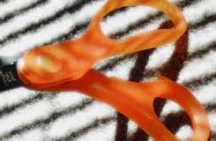
| I like the composition of this shot, but the scissors seem slightly out of focus to me. I eenjoy the shadow work and the dark lines in the background though. |
|
| Photographer found comment helpful. |
|
|
04/24/2005 07:27:15 AM |
| the black lines are distracting and the photo is fuzzy |
|
|
|
04/23/2005 10:34:22 PM |
| Too small and out of focus. |
|
|
|
04/23/2005 10:32:57 PM |
| idae hs merrit but photo needs to be bigger |
|
| Photographer found comment helpful. |
|
|
04/23/2005 10:15:37 PM |
| distracting background, focus not so good, pic too small. |
|
|
|
04/23/2005 10:02:03 AM |
I like your idea - using the shadows & light to your advantage (and I think you did that well). The problem is the shot seems a bit blurry and forced (as if you had taken this from a much larger photo and cropped out everything else. It's too close to the scissors, taking away from the potentially nice shadow you had if it had been shown in full. Sorry to score you a 4 on this one, but if you're like me (and trust me, I've been in the same boat), it'll only make you try that much harder on the next one! :-)
|
|
| Photographer found comment helpful. |
|
|
04/22/2005 04:22:13 PM |
| Poor choice of sizing, strains the eye. Looks original |
|
|
|
04/22/2005 10:51:27 AM |
| 640 pixels please, it is so hard to see quality when the shot is so small. Otherwise nice composition contrast and color. |
|
| Photographer found comment helpful. |
|
|
04/21/2005 04:31:07 AM |
| this is a little small but it also looks out of focus |
|
|
|
04/20/2005 05:08:27 PM |
| Next time and use a larger picture size. I suspect you'll be marked down heavily for failing to do this. |
|
| Photographer found comment helpful. |
|
|
04/20/2005 05:07:12 PM |
| too small and out of focus... I'm sure you can do better! |
|
|
|
04/20/2005 07:47:58 AM |
| Picture reallys needs to be larger to show the detail. Focus seems soft. |
|
| Photographer found comment helpful. |
|
|
04/20/2005 12:10:56 AM |
| Image very small, try 640 pixel long side, and save for web, to 150kb |
|
| Photographer found comment helpful. |
|
|
04/19/2005 09:51:11 PM |
| I'm not sure if this is intentional, but the brightness and lack of focus on the background are giving me a headache. Nice contrast between stripes on the scissors and on the background, though. |
|
| Photographer found comment helpful. |
|
|
04/19/2005 08:40:26 PM |
And the brown ribbon winner is....
Sorry. Here's some legitimate criticism: too small, too blurry, cropped to death, etc.
Look in the forums for tutorials on sizing images to 640 pixels if you don't know how. The size alone will kill ya. |
|
| Photographer found comment helpful. |
Home -
Challenges -
Community -
League -
Photos -
Cameras -
Lenses -
Learn -
Help -
Terms of Use -
Privacy -
Top ^
DPChallenge, and website content and design, Copyright © 2001-2025 Challenging Technologies, LLC.
All digital photo copyrights belong to the photographers and may not be used without permission.
Current Server Time: 04/07/2025 01:39:27 PM EDT.