| Author | Thread |
|
|
07/11/2005 04:05:37 PM |
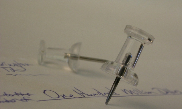
| I think finding printing a tax form or finding one at work would have been more effective. This really does read as a check and doesn't relate to taxes too much. I do, however like the placement of the tacks. The color is dull though. |
|
Comments Made During the Challenge  |
|
|
04/20/2005 10:19:27 AM |
| Kind of greyish and flat. I would have liked to see a bit of a contrast boost here. It would ahve made a world of difference. I also would to have liked to see the point of the tack behind your first tack. Composition is interesting but I dont like the hidden point of the background tack. Picky aren't I? Nice job. |
|
|
|
04/16/2005 01:41:59 PM |
| A tad dark for my tastes. |
|
|
|
04/16/2005 07:25:23 AM |
| I see no tacks. ;) focus and POV are good. Could use better lighting. Wish I had a 100 million. 7 may bump later. |
|
|
|
04/16/2005 07:03:26 AM |
| Nice composition..I would like a stronger contrast. |
|
|
|
04/16/2005 06:03:42 AM |
| based on your tax payment you should have more withheld... :) |
|
|
|
04/15/2005 10:37:32 PM |
| lighting, or brighten it up... the detail is good and the Depth of Field excellent, it is just the blah tone that bugs me |
|
Home -
Challenges -
Community -
League -
Photos -
Cameras -
Lenses -
Learn -
Help -
Terms of Use -
Privacy -
Top ^
DPChallenge, and website content and design, Copyright © 2001-2025 Challenging Technologies, LLC.
All digital photo copyrights belong to the photographers and may not be used without permission.
Current Server Time: 04/07/2025 02:51:56 AM EDT.