| Author | Thread |
Comments Made During the Challenge  |
|
|
04/19/2005 07:04:15 PM |
| One of my favorites - I really like the colors in this. Almost black and white but not quite, great job - 10 |
|
 Photographer found comment helpful. Photographer found comment helpful. |
|
|
04/19/2005 10:37:15 AM |
Well seen and composed.
Shame we don't have all the time in the world to wait until the weather/sky conditions are right. A dark, moody sky would have really helped.
If you have Photoshop, one way to darken the sky a bit would be to go into the selective colors, drop-down to the white and move the black slider over and watch what happens. All legal as it is doing to all the white in the image. |
|
| Photographer found comment helpful. |
|
|
04/19/2005 04:48:37 AM |
| uninteresting compostion. Framing is not right. |
|
| Photographer found comment helpful. |
|
|
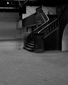
04/13/2005 04:56:36 AM |
| The high contrast makes the photo look blown out. It takes away from te clarity of the building. Nice composition with some good detail where you can see it. Good luck in this challenge. |
|
| Photographer found comment helpful. |
Home -
Challenges -
Community -
League -
Photos -
Cameras -
Lenses -
Learn -
Help -
Terms of Use -
Privacy -
Top ^
DPChallenge, and website content and design, Copyright © 2001-2025 Challenging Technologies, LLC.
All digital photo copyrights belong to the photographers and may not be used without permission.
Current Server Time: 04/07/2025 01:55:44 AM EDT.