| Author | Thread |
|
|
04/20/2005 01:40:06 AM |
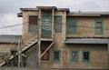
I figured a black & white picture of this scene or even color would reveal a very average and somewhat dull shot, lower 5's at best. So I decided to whack it up a bit and spark some emotion, good or bad. I seemed to have accomplished that result with this submission. =)
Thx for the comments! |
|
Comments Made During the Challenge  |
|
|
04/19/2005 01:43:36 AM |
Though meeting the challenge, the toning & selective desaturation & re-toning don't work for me in this shot. Looks kind of like PS gone mad! (please don't take that personally - not meant to offend and apologize if it comes across that way)
A clean B&W conversion with a little more sharpness woud have helped. Still, meeting the challenge, I gave you a 4.
Regards, |
|
 Photographer found comment helpful. Photographer found comment helpful. |
|
|
04/17/2005 01:37:20 PM |
| Validated or not, the heavy violet tinge is disconcerting. Time of day? |
|
|
|
04/16/2005 04:17:16 PM |
| I don't know if it's post processing or else, but I think it way too purple. |
|
| Photographer found comment helpful. |
|
|
04/16/2005 02:19:40 PM |
For me the partial desaturation does not wotk here. It produce an image which seems to loose its balance. I find myseld constantly being drwn to the green grass, and not looking at the building.
This is a shame as you have obviously found a great subject for the challenge. |
|
| Photographer found comment helpful. |
|
|
04/15/2005 01:44:25 PM |
| Sorry I dont like the color stuff that you did. Either make it all desaturated with purple color or leave it in color. The bright green of the grass pulls the eye. the purple is a receding color. |
|
| Photographer found comment helpful. |
|
|
04/15/2005 01:22:42 AM |
| Nice photograph. I just find the purple cast a little off as to what I would expect to see in a natural setting for an abandoned building. The perspective also makes it appear to me that the building is tilting backward. Then again, that is what abandoned building can do. |
|
| Photographer found comment helpful. |
|
|
04/14/2005 09:17:41 PM |
| Interesting shot. How did you manage this under the basic editing rules? |
|
| Photographer found comment helpful. |
|
|
04/14/2005 03:11:04 PM |
| Interesting try with selective colors, but I don't think it does this photo justice. It would also have been helpful to tilt the picture so that the edge of the building was parallel to the edge of the print. Exposure looks a bit soft -- probably from resizing. Might want to experiment with the USM. |
|
| Photographer found comment helpful. |
|
|
04/14/2005 07:55:54 AM |
| whats up with the purple? |
|
|
|
04/13/2005 06:54:47 PM |
| Not especially fond of the color, but like the idea. |
|
| Photographer found comment helpful. |
|
|
04/13/2005 06:29:47 PM |
| this is just plain icky..sorry |
|
| Photographer found comment helpful. |
|
|
04/13/2005 06:18:32 PM |
| I personally don't care for the coloring in this shot, the green and purple seems odd to me. |
|
| Photographer found comment helpful. |
|
|
04/13/2005 04:16:59 PM |
| not sure I like the color tones |
|
| Photographer found comment helpful. |
|
|
04/13/2005 03:23:58 PM |
| Whoa... that's quite the whacked out job on the colors... |
|
| Photographer found comment helpful. |
|
|
04/13/2005 02:57:05 PM |
| A strange purple and green combination. You may have been better off choosing black and white on this one ;) |
|
| Photographer found comment helpful. |
|
|
04/13/2005 01:45:32 PM |
|
|
|
04/13/2005 12:53:12 PM |
|
| Photographer found comment helpful. |
|
|
04/13/2005 12:05:53 PM |
| That purple tone doesn't seem to help this picture..maybe if the the green weren't there to compete..? Just a thought: maybe if the lavender were less saturated? |
|
| Photographer found comment helpful. |
|
|
04/13/2005 08:59:52 AM |
| I like the concept, but I think the hue shift was a bit too extreme. It distracts from the overall feel of the image. |
|
| Photographer found comment helpful. |
|
|
04/13/2005 08:59:09 AM |
| The desaturized colors don't work for me at all. The house looks purple on both of my monitors. If this had been submitted in natural colors, I think it would have done better. |
|
| Photographer found comment helpful. |
|
|
04/13/2005 04:27:47 AM |
| Interesting. Would have had greater visual impact if it weren't purple. Also looks a bit out of focus. |
|
| Photographer found comment helpful. |
|
|
04/13/2005 02:23:33 AM |
| Interesting title, and intesting shot. The colors in this image are a little wierd for me. |
|
| Photographer found comment helpful. |
Home -
Challenges -
Community -
League -
Photos -
Cameras -
Lenses -
Learn -
Help -
Terms of Use -
Privacy -
Top ^
DPChallenge, and website content and design, Copyright © 2001-2025 Challenging Technologies, LLC.
All digital photo copyrights belong to the photographers and may not be used without permission.
Current Server Time: 04/07/2025 01:47:16 PM EDT.