| Author | Thread |
|
|
04/09/2003 09:45:38 PM |
Greetings from the Critique Club
By Inspzil
btw thanks for the comments on my recent pictures
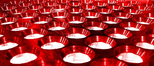
Composition - Very nice pattern. I'm not sure if its EXACTLY symmetrical, but its close enough for me. I like the deep red color and the contrasting silver or white or some light color. Anyway I like it. I'm not really fond of the wide aspect ratio you've chosen. I think you might have helped yourself out a little by making it narrower, even if the picture remained a little small. (something else I'm not fond of typically but in this case I think the lesser of 2 evils).
Technical - The DOF seems to be a bit narrow and the center of focus is beyond the closest circles. I personally think that looking at the picture, the first place your attention is drawn to should be in focus if for whatever reason, the whole pic is not perfectly focused. In this case the first place I noticed was the bottom of the pic which in this perspective would be closest to me. I think that is the part where the focus should be the clearest. I think you might've oversharpened this just a little. The circles are showing a little grain to them which is a good indication of that. I normally blow mine up to 70 or 80% before I sharpen them to see the effect. I'm not sure how PSP works though with the sharpen feature. For me, I sharpen everything as the very last thing I do with every picture after resizing.
Overall - A good quality first showing, better than my 4.9 at the onset of my DPC career. Is that Aluminum in those little cups? Just curious. The colors really make this picture. I think you really had a good idea, just needed to be a little clearer out of the camera. Good job on your first and good luck in future challenges. I'll keep looking for your comments. - Inspzil |
|
 Photographer found comment helpful. Photographer found comment helpful. |
|
|
04/09/2003 01:23:19 PM |
| Can you help my with the trouble of focusing. I have Canon Powershot s30 camera, and as you can see in the theme "Color", my picture, My candy, is out of focus. I have seen many good photos taken by camera like mine. |
|
| Photographer found comment helpful. |
Comments Made During the Challenge  |
|
|
04/06/2003 02:47:58 PM |
| This appears to be more pattern than symmetry. |
|
| Photographer found comment helpful. |
|
|
04/04/2003 11:29:23 AM |
| Cool! What is it? Lights? |
|
| Photographer found comment helpful. |
|
|
04/03/2003 02:34:18 PM |
|
| Photographer found comment helpful. |
|
|
04/03/2003 05:29:15 AM |
| I don't know what this is exactly, but it looks like grate material with a red light on the camera side of it. Interesting concept, nicely executed photo |
|
| Photographer found comment helpful. |
|
|
04/02/2003 10:51:45 PM |
| I like the composition, but the image seems uncomfortable to look at for some reason - perhaps oversharpened or blown highlights, I can't quite put my finger on it. |
|
| Photographer found comment helpful. |
|
|
04/01/2003 11:50:06 PM |
|
| Photographer found comment helpful. |
|
|
04/01/2003 05:46:30 PM |
| Donno what this is, but it looks gorgeous. (9) |
|
| Photographer found comment helpful. |
|
|
03/31/2003 05:16:52 PM |
| good pattern and symmetry but the foreground is pretty difficult to make out what it actually is. |
|
| Photographer found comment helpful. |
|
|
03/31/2003 10:37:28 AM |
|
| Photographer found comment helpful. |
|
|
03/31/2003 10:18:47 AM |
| Nice perspective and colour. |
|
| Photographer found comment helpful. |
Home -
Challenges -
Community -
League -
Photos -
Cameras -
Lenses -
Learn -
Help -
Terms of Use -
Privacy -
Top ^
DPChallenge, and website content and design, Copyright © 2001-2026 Challenging Technologies, LLC.
All digital photo copyrights belong to the photographers and may not be used without permission.
Current Server Time: 02/01/2026 05:45:17 AM EST.