| Author | Thread |
Comments Made During the Challenge  |
|
|
04/19/2005 06:05:02 PM |
|
 Photographer found comment helpful. Photographer found comment helpful. |
|
|
04/18/2005 11:12:14 AM |
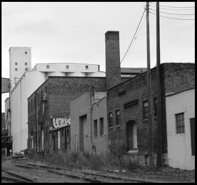
| I don't think there is enough contrast in this picture for b&w to work well. Overall, it just seems to be gray. |
|
|
|
04/15/2005 08:02:41 PM |
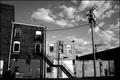
| well seen but no point of interest the eye wanders all over 4 |
|
| Photographer found comment helpful. |
|
|
04/14/2005 07:56:22 PM |
| Very nice. one of my favorite B&Ws. Nice comp and use of negative space and perspective. |
|
| Photographer found comment helpful. |
|
|
04/14/2005 07:32:08 PM |
Great composition and depiction of urban decay in the neighborhood. Your choice for making it a B&W was a wise one.
Well Done! |
|
| Photographer found comment helpful. |
|
|
04/14/2005 12:52:10 AM |
| Not too much contrast here, maybe it's me not liking industrial type buildings? |
|
|
|
04/12/2005 09:22:48 PM |
| easy to see the train line is abandoned, but less easy to tell that the building(s) are. Nice tones. |
|
Home -
Challenges -
Community -
League -
Photos -
Cameras -
Lenses -
Learn -
Help -
Terms of Use -
Privacy -
Top ^
DPChallenge, and website content and design, Copyright © 2001-2025 Challenging Technologies, LLC.
All digital photo copyrights belong to the photographers and may not be used without permission.
Current Server Time: 04/07/2025 02:36:45 PM EDT.