| Author | Thread |
|
|
12/03/2007 09:05:46 PM |
| I was going through your abandoned building portfolio knowing that one had to be your entry already reading your comments on the "Illuminate" entry. When I got to this I thought "this would have been a good choice" I scroll down and then saw it was the one you chose. :) I think yo umade the right choice. |
|
 Photographer found comment helpful. Photographer found comment helpful. |
|
|
09/09/2005 12:48:17 PM |
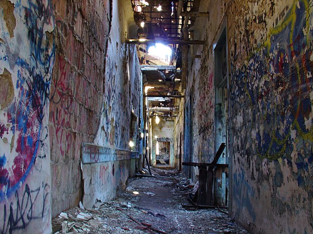
| The colors and textures are amazing. I really like the perspective too. Nice offset composition - good job. |
|
| Photographer found comment helpful. |
|
|
09/09/2005 09:01:59 AM |
| As creepy as this is, I love it. The light is wonderful and illuminates the many colors so well. Good job. |
|
| Photographer found comment helpful. |
|
|
09/09/2005 07:08:18 AM |
| Great image. I'd tone down the blues a stop or so, and move the pov about a foot to the right, but that's just nitpicking. |
|
| Photographer found comment helpful. |
|
|
08/26/2005 04:46:59 AM |
Love the colors, the texture and the great perspective of the hallway. The blown-out highlights are a little distracting, and I wonder if a more off-center, slightly angled composition/view would be a bit more dynamic.
Don't get me wrong- I'm not saying I don't like this image - it's great! Just looking at it with an eye to it having the potential to be even more powerful than it already is. |
|
| Photographer found comment helpful. |
|
|
06/01/2005 01:10:21 AM |
| Very cool! how did you find this one????:) |
|
| Photographer found comment helpful. |
|
|
04/30/2005 11:12:33 PM |
| You have a great eye Tony. I love this image. I'm glad I finally found it. Nice colors and "feel". Well done! |
|
| Photographer found comment helpful. |
|
|
04/20/2005 01:37:46 PM |
| This was great. A 7 from me - only real detractor was that hot spot at the top-middle. As far as my idea of "meets the challenge" a 10++++ :) |
|
| Photographer found comment helpful. |
|
|
04/20/2005 01:26:58 AM |
WOW! Did you go in this place going against any no tresspassing signs?
This is a awesome perspective and I say that you did right by entering it.. Would love to see more from this place.. |
|
| Photographer found comment helpful. |
|
|
04/20/2005 01:24:35 AM |
|
| Photographer found comment helpful. |
Comments Made During the Challenge  |
|
|
04/19/2005 03:54:59 PM |
|
| Photographer found comment helpful. |
|
|
04/18/2005 02:49:22 PM |
| Great concept for drawing the eye, except that the flare at the top takes you right to it. |
|
| Photographer found comment helpful. |
|
|
04/18/2005 01:59:27 PM |
| too much clutter in this shot, for my taste |
|
| Photographer found comment helpful. |
|
|
04/18/2005 03:14:43 AM |
Nice artistic interpretation on this challenge.
There is beauty in what society calls an eyesore. |
|
| Photographer found comment helpful. |
|
|
04/16/2005 05:12:04 PM |
| This seems like it was a difficult picture to get considering the lighting. Good job. Don't think I will be going there anytime soon..10 ;) |
|
| Photographer found comment helpful. |
|
|
04/16/2005 03:52:57 AM |
| There is quite a few hotspots in the center of the frame that I find to be very distracting. I assume its where the roof is off near the top center of the photo is the worst one of all. I also find that the photo could have been rotated about 1 or 2 degrees ccw to level out the photo properly. I think the image has some good color but lacks clarity due to image resizing. A different crop of this photo ould have made a greater impact on this photo. Good luck with this challenge. |
|
| Photographer found comment helpful. |
|
|
04/15/2005 10:03:05 PM |
| Unless intended, I think the white-balance could be a bit warmer. Nice textures. |
|
| Photographer found comment helpful. |
|
|
04/15/2005 03:40:39 PM |
| Good shot. Color seems a bit off (purple haze on the floor--with my monitor). Good perspective. The blow out at the top is distracting. |
|
| Photographer found comment helpful. |
|
|
04/15/2005 11:52:15 AM |
| Cool colors, cool perspective. |
|
| Photographer found comment helpful. |
|
|
04/15/2005 06:43:59 AM |
a slight rotation to the left would have helped, otherwise pretty cool... watch for distracting highlights in the frame too like the sun at top.
|
|
| Photographer found comment helpful. |
|
|
04/14/2005 01:10:43 PM |
| certainly this meets the challenge subject wise, a good find, the light from some spots looks overexposed and some detail seems to be lost but the graffiti adds alot of interest all in all a pretty cool shot |
|
| Photographer found comment helpful. |
|
|
04/14/2005 12:30:38 PM |
| Excellent title for a really bad scene |
|
| Photographer found comment helpful. |
|
|
04/14/2005 10:09:01 AM |
| I think it would look alot better in B&W |
|
| Photographer found comment helpful. |
|
|
04/14/2005 09:53:57 AM |
| Very nice... I love the sunlight coming in. |
|
| Photographer found comment helpful. |
|
|
04/13/2005 10:49:32 PM |
|
| Photographer found comment helpful. |
|
|
04/13/2005 08:23:44 PM |
| Unique shot..it's the angles, the corridor and the light...it has a luminescence and a frightening quality..good composition..8 |
|
| Photographer found comment helpful. |
|
|
04/13/2005 05:58:04 PM |
|
| Photographer found comment helpful. |
|
|
04/13/2005 04:59:46 PM |
| This looks like the hallway of Saw... and other horror movies!! lol really good work !! 10 |
|
| Photographer found comment helpful. |
|
|
04/13/2005 04:35:40 PM |
|
| Photographer found comment helpful. |
|
|
04/13/2005 05:55:38 AM |
| This is one of my favorites in this challenge. I love the colors, the textures, the composition, and evern the blast of light which illuminates it all. I find myself trying to read the 'writings on the wall'. <9> |
|
| Photographer found comment helpful. |
|
|
04/13/2005 01:57:28 AM |
|
| Photographer found comment helpful. |
Home -
Challenges -
Community -
League -
Photos -
Cameras -
Lenses -
Learn -
Help -
Terms of Use -
Privacy -
Top ^
DPChallenge, and website content and design, Copyright © 2001-2026 Challenging Technologies, LLC.
All digital photo copyrights belong to the photographers and may not be used without permission.
Current Server Time: 02/01/2026 09:47:13 AM EST.