| Author | Thread |
|
|
04/26/2005 06:11:55 PM |
hello from CC.
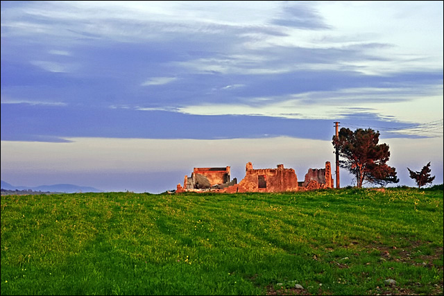
I like this landscape. However in a challenge like Abandoned buildings..where the main criteria for meeting the challenge is to show texture and color, this doesnt work here. But you did score well, due to your great composition. It's a real vibrant photo, cropped real nicely too. Your title fits the subjects well also.
What I think you should of done here, is show more sky and less grass. This would give the photo more of a out of this world feel to it.
me piace questo photographia..my italian isnt too good.. good job overall !! |
|
 Photographer found comment helpful. Photographer found comment helpful. |
Comments Made During the Challenge  |
|
|
04/19/2005 11:09:48 AM |
| colors are great but bldg with red is too small and out of focus imo but good photo |
|
| Photographer found comment helpful. |
|
|
04/18/2005 03:34:05 PM |
| I think I would have cropped this thighter at the bottom to show a little more detail of the building. |
|
| Photographer found comment helpful. |
|
|
04/17/2005 09:51:58 PM |
| Almost looks too saturated but I still like it. |
|
| Photographer found comment helpful. |
|
|
04/17/2005 09:33:16 AM |
| The photo seems to be a bit oversaturated |
|
| Photographer found comment helpful. |
|
|
04/16/2005 09:38:11 PM |
| Very nice subject for the challenge - color and sky is nice as well. |
|
| Photographer found comment helpful. |
|
|
04/16/2005 08:41:05 PM |
| Very good and atmospheric shot. I love this scene, the colours and the composition. Well done and good luck! |
|
| Photographer found comment helpful. |
|
|
04/15/2005 04:23:00 PM |
| the colour really worrks here. |
|
| Photographer found comment helpful. |
|
|
04/14/2005 09:55:42 PM |
| awesome. love the perspective you chose |
|
| Photographer found comment helpful. |
|
|
04/14/2005 08:52:49 PM |
| Nice landscape, but it would have been better if you would have gotten closer to the building. The building looks interesting, but it's just to hard to tell. I like the picture though. |
|
| Photographer found comment helpful. |
|
|
04/14/2005 07:55:27 PM |
| I think I would have liked this one a little more with more grass and from down lower. Were you lying belly down already, though. I rolled this down to where the top showed just above the pole's top to get the "feel" - you made a terrific decision not to crop away from the left. |
|
| Photographer found comment helpful. |
|
|
04/14/2005 01:43:20 PM |
| beautiful, vibrant, contrasting colors. nice capture. |
|
| Photographer found comment helpful. |
|
|
04/14/2005 10:59:12 AM |
|
| Photographer found comment helpful. |
|
|
04/13/2005 10:39:15 PM |
|
| Photographer found comment helpful. |
|
|
04/13/2005 04:43:46 PM |
| like the color choices and cropping here. wish this were ALOT bigger - the kind of image you can wander through. Beautiful location. 7. May pass again |
|
| Photographer found comment helpful. |
|
|
04/13/2005 02:17:13 PM |
| Very nice composition for this shot. The deep saturation works very well here. |
|
| Photographer found comment helpful. |
|
|
04/13/2005 11:41:03 AM |
| Good use of negative space. Great color too ! |
|
| Photographer found comment helpful. |
|
|
04/13/2005 08:21:29 AM |
| Beautiful colors. Wish the building were a little sharper. Nice composition. Good lighting. |
|
| Photographer found comment helpful. |
|
|
04/13/2005 07:50:00 AM |
| Great picture but oversaturated |
|
| Photographer found comment helpful. |
|
|
04/13/2005 03:26:32 AM |
| cool title, nice sky ..not much of a building though! |
|
| Photographer found comment helpful. |
|
|
04/13/2005 01:20:45 AM |
| although the surroundings and sky are nice, I would have like a closer shot on the building. |
|
| Photographer found comment helpful. |
Home -
Challenges -
Community -
League -
Photos -
Cameras -
Lenses -
Learn -
Help -
Terms of Use -
Privacy -
Top ^
DPChallenge, and website content and design, Copyright © 2001-2026 Challenging Technologies, LLC.
All digital photo copyrights belong to the photographers and may not be used without permission.
Current Server Time: 02/01/2026 09:16:09 AM EST.